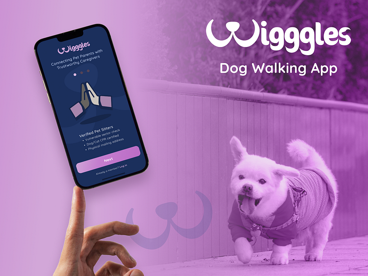
Wigggles Dog Walking App - Product Design
Overview
Wigggles is a service for dog owners with busy work schedules that sometimes need help providing care for their dogs. Wigggles matches dog owners with trust-worthy care givers giving them peace of mind during their time away from home.
My role
Product Designer with mentor and peer group
Responsibilities
Problem definition, user research, UX/UI design, visual design
Timeline
This project took place over 10 weeks between June and August, 2022
THE PROBLEM
How might we successfully match dog owners with reliable dog walkers while making their experience easy and painless
Dog owners sometimes need help caring for and walking their dogs. They are not always able to find a reliable person, family/friends aren’t always available, dog owners need to know their dogs are in safe hands.
THE GOAL
Simplify the dog care process
Make the service easy to use, with fast payment processing, with relevant data from the walker / owner / dog to make online matches accurate and successful.
RESEARCH
Digging into pain points
USER RESEARCH
Personal interviews
After speaking first-hand with working professionals; This is what I learned.
MARKET RESEARCH
Competitors
Pros and cons of the competition.
DEFINING THE USER
Persona
After gathering market and user research, and data from interviews; I found patterns in user perceptions and based my user persona on those findings.
DESIGNING THE EXPERIENCE
User flow
This user flow focuses on creating trust with Plane Jane. It makes it easy for new users to explore the app before fully committing and creating an account. This is better than other apps because Jane will only create an account once she has explored all the features and when she has found a potential match for Atlas, her dog. Features include search filters based on service, location, price, date and an opportunity to include some top level characteristics about the dog.
DESIGNING THE EXPERIENCE
Wireframes
I started with the onboarding experience to capture how to build trust with the user.
DESIGNING THE EXPERIENCE
Wireframes V2
After user feedback I created iterations to the initial designs. Having an opportunity to see an introductory video of the care giver was essential to find successful matches.
VISUAL IDENTITY
Mood board
Creating an identity that resonates well with Plane Jane is very important. The colour scheme and typography is trustworthy, contemporary and playful.
INTERFACE DESIGN
Onboarding
The splash screen takes the user through the highlights of the app, building trust from the start. Then Leading them to the search filters to find a successful match.
INTERFACE DESIGN
Onboarding iteration
After users tested the prototype, some important changes were needed to enhance the user experience.
INTERFACE DESIGN
Login & Home
Further prototype testing uncovered some more important findings.
TESTING RESULTS
Search & Home
After testing the 3rd iteration of the prototype. Further pain points were discovered. View the prototype here.
OUTCOME
WHAT I LEARNED
I learned that a fine tuned low fidelity prototype is super important to iron out the kinks in the user’s journey.
Visual design should be at the final stages of the process to save time and resources.
A prototype should have minimal dead ends to maximize user feedback during testing.
On my next iteration I would address all the user pain points to enhance the user experience even further.
Learning from the user allows you to detach from your designs and see them in a different lens.


