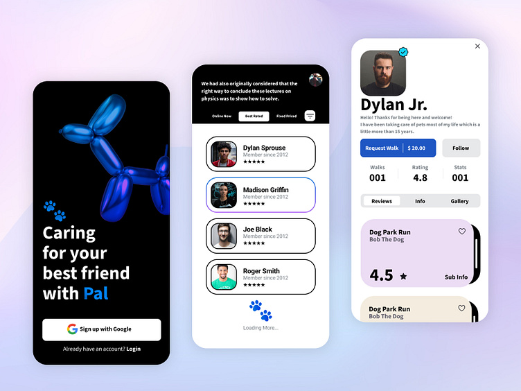
Pal - Dog Walking App
Hello Dribbler 👋🏻 🏀
Here is my mobile responsive concept for a dog walking app 🐶
“Pal" is a mobile application that connects dog owners with trusted dog walkers in their area.
My Role
I was responsible for exploring product problems, developing design solutions that solve these problems, applying changes based on the user's feedback, and implementing a visual design for them, this includes the branding as well.
Design Process
My design process was not linear. especially getting into the end I would go back and forth between the prototype and the User Interface design.
Research
I conducted two in-person interviews with dog owners. And two video calls. between Los Angeles and San Diego, California. Although not all of them have used some sort of dog walking app some mentioned Rover. Overall the people are happy with the usability of the app but unhappy trying to find a walker/sitter available in real-time. Notice that the two main popular applications “Rover/Wag” had similar green and orange tones with little to be differentiated.
Market
The market has a couple of walking apps. However, the top apps suffer from congested interfaces that impact usability. The goal of Pal is to make the process of searching for a reliable dog walker easier, with features such as in-app chat and direct messaging while having a filter of availability and ratings. Most of the common users of other apps researched are people that live by themselves and get busy running their everyday lives and they cherish and enjoy the companionship of a pet.
Persona
Based on user research, the dog owners' frustrations, goals, and ambitions were defined.
User Flow
Here is a revised flow based on my research. This flow shows the onboarding process until entering the to dashboard ready to explore the walkers available.
Wireframing
Wireframing My initial thought was to create a statement on 1st onboarding screen and then give users multiple ways to filter dog walkers. The first round of sketches included a dashboard and initial screens of trending categories.
Visual Design / Design System
Wanted to go in a very opposite direction from the current branding from other applications and researched apps, creating a look and feel of an on-trend color combination of purple and pink to have a gradient and a nontraditional dog in this ballon elements. To have a little bit of edge and total distinction.
Results
Users were astonished by the interactions of the prototypes so they were a good addition as signifiers while surfing through the app, visually appealing and a nice surprise that they didn't know they needed to make them trust the app created.


