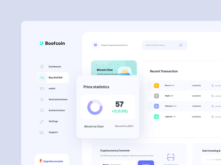
Crypto Exchange - Dashboard
Hello everyone! 👏🥳
Presenting a Light/Dark dashboard ui for a Exchange Project. from this dashboard you can easily see the report of your Recent Transactions. Please share your feedback about the color choice and placement of the elements.
What are your thoughts about this work?
Would you like to see more ? Let's scroll down now !
Hope you enjoyed and press the "L" button As well, And let me know what you think about it in the comments 🔥
Follow me :
Instagram | Behance
Sidebar navigations
Three-layer sidebar navigation bar. This is one of the default and necessary components in the user's use of the dashboard, in this design we tried to make the important elements and links available to the user.
Sidebar navigation is very useful, it helps the user to move through an application. Vertical layout of navigation items is useful for accommodating large menus. Sidebar navigation should be as useful as possible, with clear and accessible links to wherever the user might need to go without causing confusion and error in the user's selection of links.
Thanks for watching
I hope you will like the project ! More amazing projects will follow soon! 🔥
✉️ Have a project idea? We are available for new projects at saeedyousefi@live.com | Send me a message


