dog-go: A pet services app
Design Brief
The original goal of the project was to create a Dog Walking app that differed from other apps on the market. However, as I began to conduct one-on-one interviews, my participants told me that they’d prefer to have a simple and easily accessible boarding app instead. To accommodate more users, I created a pet services app that encompassed both offerings.
The duration of this project took 12 weeks, and while it focused on all areas of a Product Designer’s role, I concentrated mostly on the UX Research aspects.
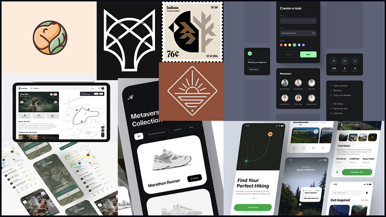
(To view the final prototype, click here. To see how I got there, keep reading!)
Problem Statement
The potential users weren’t happy with their current dog boarding situation. Too many of them were relying on friends and family while others didn’t love the kennel they were taking their dog to. All 10 participants said that they’d be willing to pay a reliable sitter.
1) Research Process
Solo Interviews:
As stated above, there were 10 participants in the study, all of who own dogs. All 10 participants travel frequently and that was their main reason for preferring an app that had a dog boarding section.
The main aversion participants stated in using a app for boarding their dog was “signing up for another thing” and a lack of trust in the app itself.
Market Research:
To gain a better understanding of other dog walking apps, I looked at Rover and Wag, two of the most popular dog walking apps on the market. Each of these apps also allows owners to board their pets.
The main issue I found with each of these apps was that users had to sign up at the beginning of the process or include a lot of information before they were able to see the available sitters in their area.
2) Journey Mapping
Persona Creation:
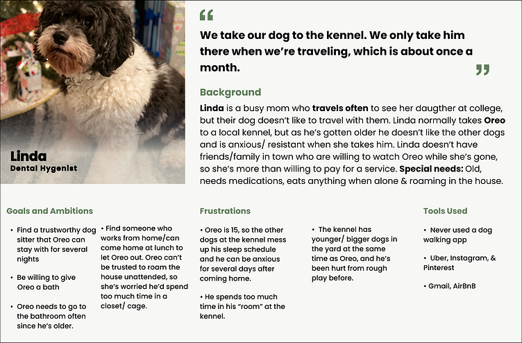
Based on my research, I created a persona that wanted a simple streamlined process. This user isn’t the most tech-savvy and needs solid evidence to be convinced she should switch over from the service she’s currently using. This user needs to be shown how her life will be easier with this app.
User Flow:
After taking the interviews and compiling them to create the User Persona, I made a User Flow that I thought would work best for the user. The main difference in this flow from other pet services apps (like Wag or Rover) is that the sign-up option is put toward the end of the flow and a user can reach a sitters' information quickly. dog-go also provides more filter options than Rover since a user can select if they have numerous dogs or cats.
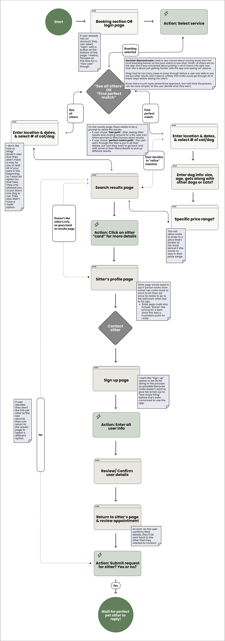
In addition to my User Flow, I created a flow for both Wag and Rover to help them guide me in my decision-making process. You can find them here.
3) Wireframes & Ideation
Brainstorming with FigJam
To begin the brainstorming process of what the final lo-fi Wireframes might look like, I started drawing with FigJam simply to put numerous ideas down for each page. Once I had a couple of designs I was happy with, I started transferring my ideas over to Figma to tweak & finalize them.
Figma Wireframes
I create two versions of each mobile page, and then conducted another round of research with my same participants from the first phase (this is an area where I was lucky they were easy to contact). In this research phase, I asked each participant which version of the page they preferred.
Based on their answers, and my market research, I selected the most “user friendly” wireframes for each page.
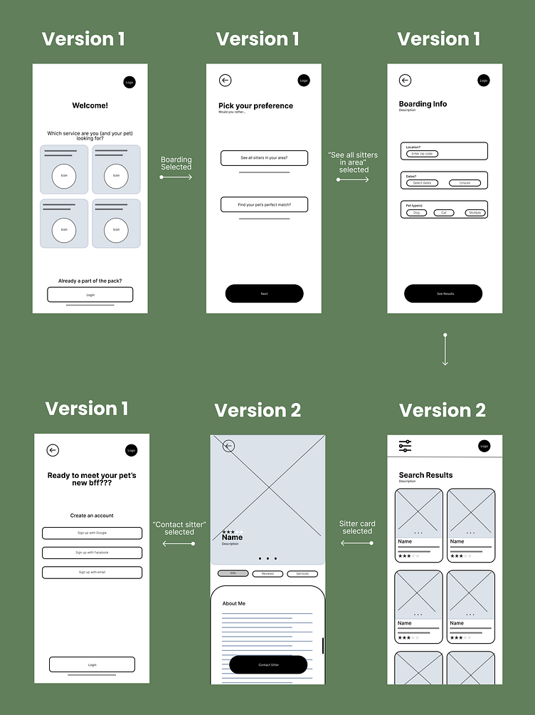
(Check out both wireframe versions here.)
Learning moment:
With the way that our class schedule worked, we didn't learn prototyping until after the visual design phase. However, I think it would have been beneficial to test the usability of the Wireframe itself instead of waiting until the visual design had been created.
4) Visual Design
During the Wireframe phase of the design process, I also asked each of my participants what color they associated most with a dog walking app. 80% of them responded with the color green. The overwhelming reasoning was because of “dogs being walked outside, so it just makes sense that the app has an ‘outdoorsy feel.’” (Participant #3, Female, Age 27)
Mood Board
From my participants’ input, I put together a mood board that was nature-focused and incorporated simple designs. Many of my participants also commented that they enjoy a minimalist approach in their apps so they aren’t easily distracted/ can’t find what they’re looking for
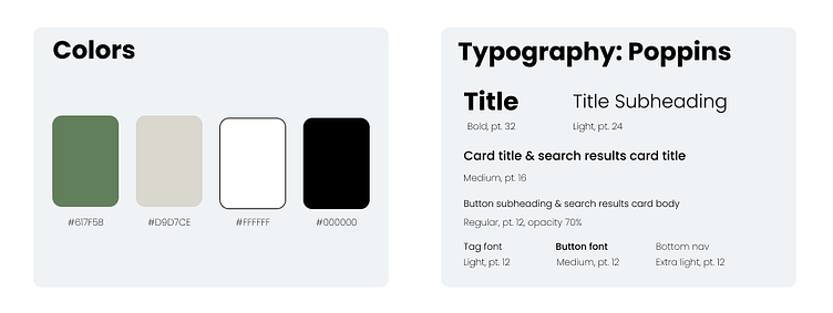
Color & Font Selection
Based on my market research, I knew that both Rover and Wag’s primary color was green, so I opted for a different shade than their green. I decided to go with a darker shade of green as the primary color and ultimately chose the darker shade because I wanted the app to also provide a nature-focused” and “forest” feel.
I also selected Poppins as the font for the app because it's an easy-to-read, non-distracting font.
Once I'd chose the colors and font, I started filling in my Wireframes and I ended up with the first draft of my visual design below.
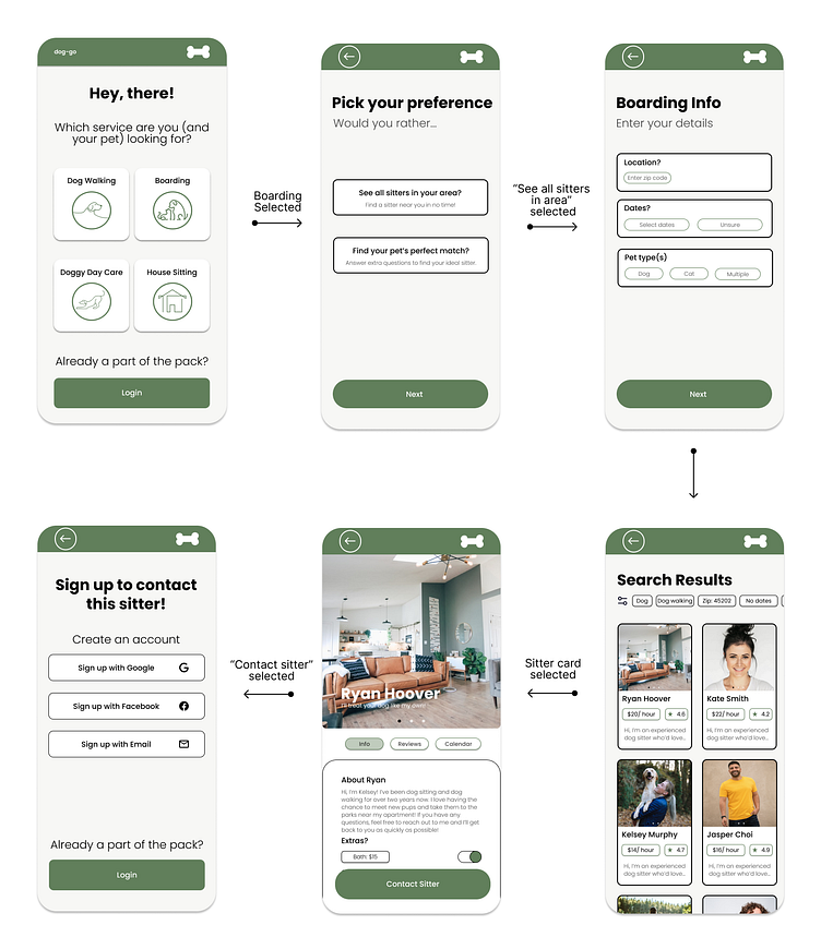
Note: It was a conscience design decision to not include a bottom nav bar in any of the pages because the user wouldn’t be signing up or logging in until after they’ve seen the available sitters. Adding a bottom nav bar would only confuse the user because it would lead them to click on an area that has no information (yet). I also didn't want to confuse the user by giving them too many options to look at.
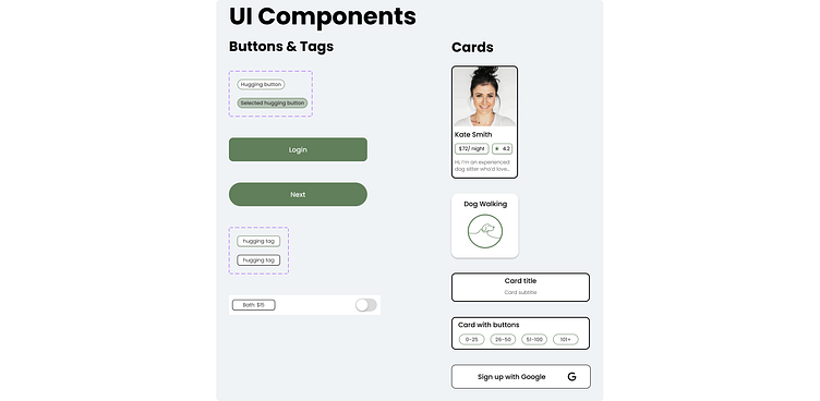
5) Component Library
As I built out my visual design, I also built created the components in my design system to ensure congruity across the app.
6) Prototyping & Iterating
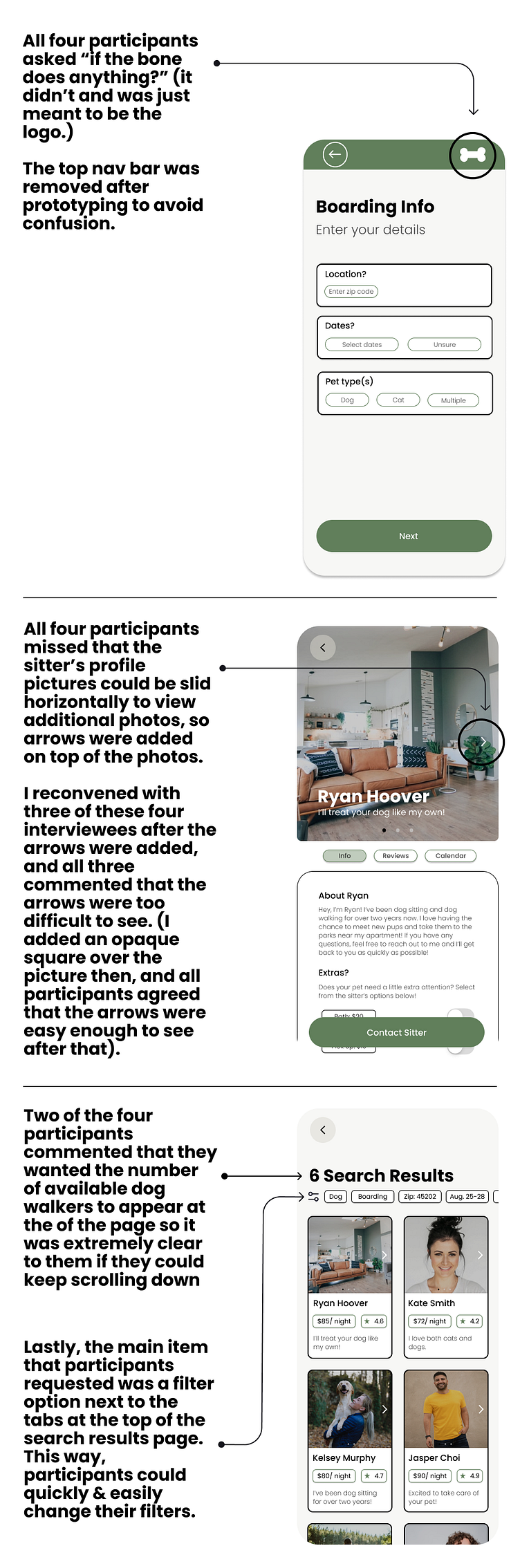
Only nine of my original 10 participants took part in the prototyping phase, but the prototyping tests revealed some extremely helpful information for changes that needed to be made to make the app more functional.
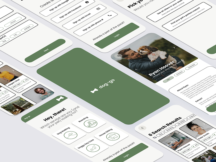
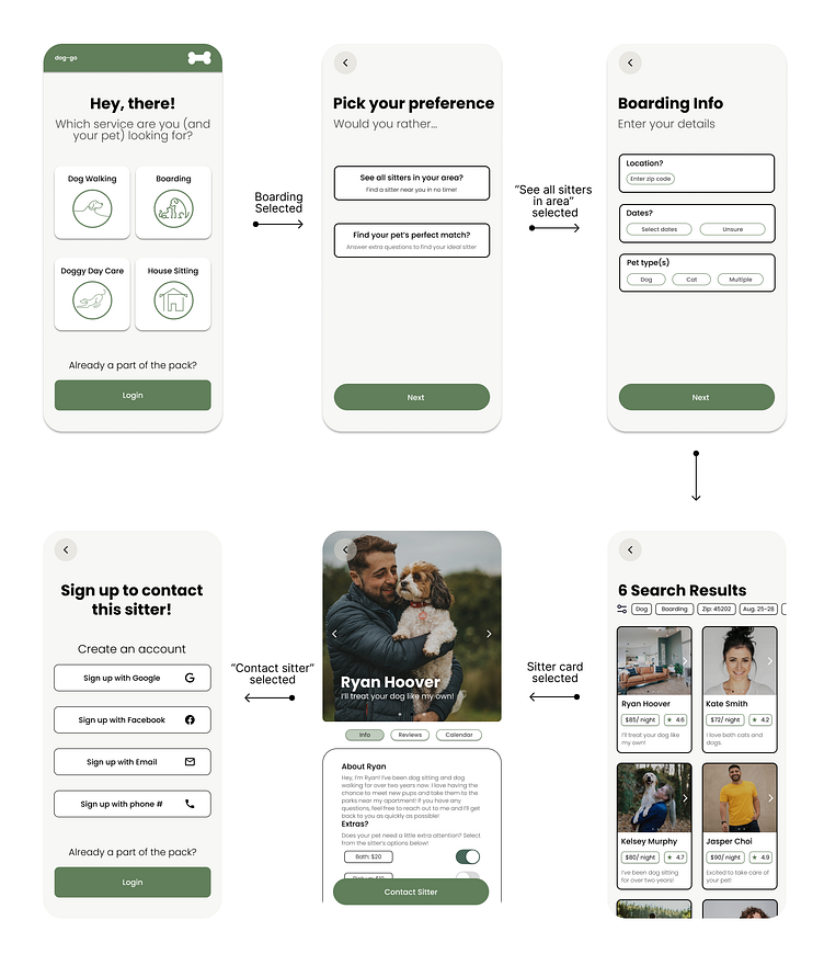
Final UI:
Based on all my research and user feedback, below is final version of the app!
To give the prototype a try yourself, click here.
Learnings
From this project, I have a better understanding of how the initial research designates the design, feel, functionality, and tone of the final product. At each stage of the process, I kept my user persona in the back of my mind and used it to guide me.
For true research on a product, I’d need to ask more questions upfront. I was lucky that my family and friends were easy to get ahold of and provide additional information on design decisions, but, in a business situation, it wouldn’t be so simple to contact the original participants.
All of my participants were dog owners, and none of them had cats, but to fit with a larger percentage of pet owners, the app should be adjusted to be more “cat-friendly.”
Let's Chat
If you have any questions or comments, don’t hesitate to put them in the comment section below! 👇
