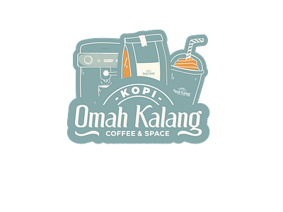
Sticker Design For Cafe
We wanted to create a sticker design for a cafe that implements what the cafe is about. The idea of the sticker was to have it look like an old-school, hand-drawn illustration, with the letters being scribbled out with an ink pen. We wanted to use a black background because we felt like it would be more striking and eye-catching than anything else.
We also wanted to make sure that our audience would feel like they could relate to this sticker, so we included some sort of fruit within the illustration. This helped with the theme of our design, as well as making sure that there was something in there that people could relate to—especially since this sticker will be used by people who are into healthy eating!
More by Daniel Cientifica View profile
Like
