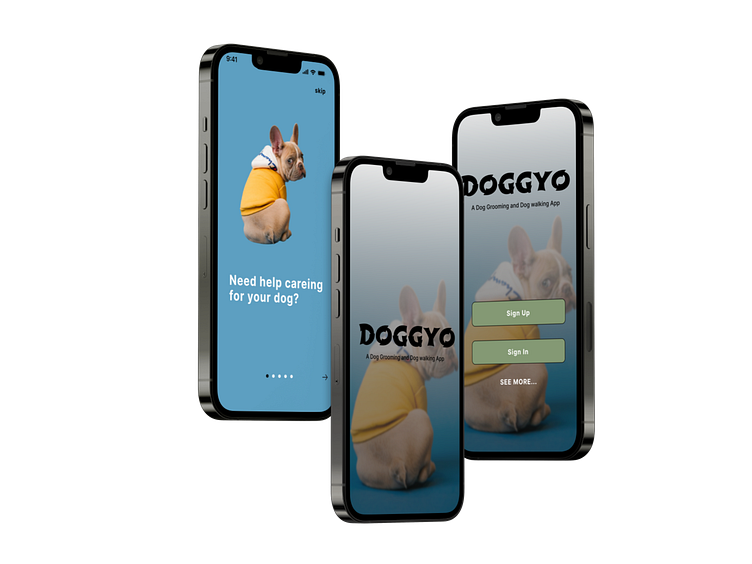
CASE STUDY
Food for Thought
"A Dog is the only thing on earth that loves you more than you love yourself"- Josh Billings
"Pets are humanising.They remind us we have an obligation and responsibility to preserve and nurture and care for all life." - James Cromwell
"Animals are such agreeable friends , they ask no questions , they pass no criticisms."- George Elliot
Introduction
A Dog Walking And Dog Grooming Mobile Application
An Online Community of Dog Lovers, who’s top priority is to help prolong dog life span through Providing, Enlightening and sharing tips on Nutrition, Hygeine, Emotional and physical Developement. Using the Nigerian Animal Care Culture as case study, to design a digital solution for the African Market.
Project Overview
People in Nigeria are use to personal trainers, vetinary services which includes grooming. Most people walk their dogs when they have the time or send their domestic staffs or gate men , who have little knowledge of dog care.
Lack of qualified dog walkers.
Due to the insecurity in the country, more focus should be on dog walker authentication by carrying out proper due diligence.
My Role
Design Process:
Brand Name – DOGGYO
LOGO Design Process
Timeframe for designing Logo: it took approximately 1 hr.
Duration for User research: 3weeks, June 6- June 13 2022.
Duration for User Interface: 4weeks.
Brand Color; Green, Black, Blue,Yellow.
Brand color codes: #d2bf55, #000000, #5D9FC1
Brand Fonts: Inter, Poppins.
Having a clearly defined problem, I Played the role of a Product Designer in this project where i took Sole Lead from Ideation through Product testing and development of the Product Prototype. I conducted Market Research with design thinking by leveraging on descriptive, Inferential and Evaluational note taking techniques and Interview Using the Internet, Google and Whatsapp, to gather information through market research and usability testing. Doing this will ensure thorough User Research was carried out.
I created the User Persona ,Designed the User Flow, Wireframes, Visual Design to the final Prototype using Figma. A community oF future forward designers was an effective design tool that proffered Web3 digital solutions enabling me deliver future forward design Prototype .
When designing this solution I used these tools Figma, fig jam, Unspash, font awesome, and Tailor brand, to better express the user’s pain point. After considering the problem statement, the creative director asked me to make the brand accessible by making the user interface relatable to its users, considering disabilities, language, and educational background of the target market as shown in the overall design aesthetic. The brand colors and fonts were finally chosen after extensive research on colors. Yellow expresses a positive feel, joy, playfulness,energertic, promotes awareness, and invokes innovation. Black, represents Power, Elegance, and prestige. Blue represents vibrant high positive spirits and Green represents nature and wealth. All these are an expression of the brand’s identity.


