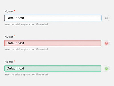
Curricoolum – Form validation
The idea for this form validation system is a simple one: it uses highlighting in conventional colors (red for validation fail, green for validation pass) to communicate with the user. To reinforce this simple logic I added a skeuomorphic UI element, the led on the side of each form.
Check out the attachment to see the full UI!
===
See the full project on Simplest Interactive, my UI/UX Studio: http://www.simplest.io/work/curricoolum.html
More by Alessandro Di Tecco View profile
Like

