Perseverance - close-up
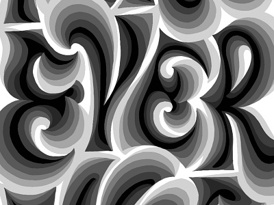
The word, or rather a close-up of it, that has started it all for the 36 Days of Type project - Perseverance. The style for this piece was a bit of an accident - I was thinking about ways to add some visual complexity to the letters and shading seemed like a good place to start. As I was adding layers I've notices that there was an interesting volume building up, so I've added more shades and played a bit with the silhouette, and that's how it all came together.
You can see more of it on Behance.
Peace!