Personal Website
One pager to try out Webflow and create a nice thing to find for everybody who's googling me.
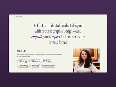
This website is about me, so I used an approach for design choices which I usually don't go for: I just picked what I personally liked best.
Typographywise I decided to go for a condensed serif, as this is a typography trend which I really like for the 80ies retro vibe it gives me.
For the color palette I picked purple for highlights, because it's a color I've always enjoyed. For the background I used a super-light green because it's an interesting contrast with the purple. And for text I chose to go with a mid to light grey as it is a bit softer on the eye than full black and it also plays well with the retro vibe of the font (thinking of text printed by a copy machine which is low on ink ).
Check it out by yourself: www.lisa-weishaeupl.com