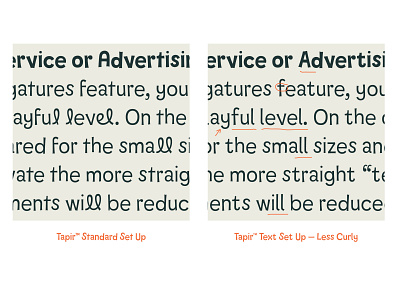
Tapir — Standard vs. Text Set Up
Display vs. Text Settings
As fun as Tapir’s curly forms are, we also needed to think about different usage fields. Big headlines and logos are covered either with curly or more straight forms, but when it comes to text passages the focus is on reading rhythm and fluid text dynamic. More info: https://www.hvdfonts.com/fonts/tapir
More by HvD Fonts | Type Foundry View profile
Like
