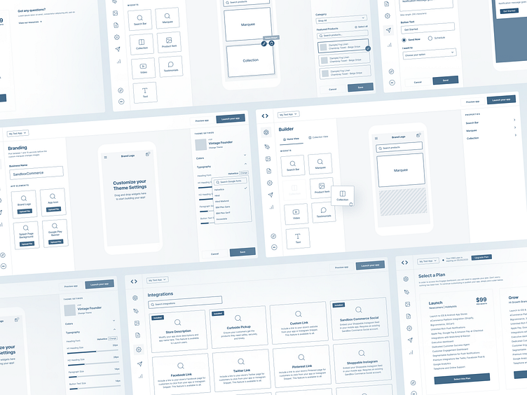
Low Fidelity UX Wireframes - SaaS Project Builder
Hey everyone 👋,
Sharing you some early exploration wireframe screens of the app builder. After I've successfully redesigned the landing pages of recent project. I had the opportunity to explore and revamp their web application as well.
This project is a custom web app builder where users can build their own native mobile shop app. Easily integrate popular tools or platform like shoppable instagram, social links.
The Challenge
📍Revamping all pages into more user-centered and friendly web application with limited time.
📍Optimize builder screens and making sure the designs are feasible on the development team.
User Painpoints
📍At first glance, when arriving to the Dashboard page, it's very confusing on what to do next.
📍Customizing your mobile project app inside the builder is very slow and only show limited options.
📍Not being able to track analytics and see trending products on their mobile shop app.
Hope you like it! Tell me what you think in the comments, your feedback really means a lot.
Have a project in mind? I'm available for freelance projects. Let's talk!
📩 Email: nooweel@gmail.com
