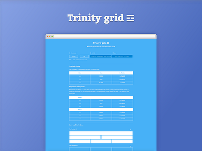
Trinity grid ☲
Hi guys !
Here is one of my latest project, I think about it since a long time now, I had some free time yesterday, and I decided to create it.
It's juste "an other" grid system, but this one got a secret, this one may be the simplest grid you'll ever met.
It got only 3 columns, it can be nested, it's responsive ( or not, depending on what you want ) , you can also offset the columns.
I created it because I needed a simple and responsive grid system, and I had this one in minds, I received some good feedbacks, so I think it can interest some of you guys !
It was added to the Bower package manager, so you can download it via :
$ bower instal trinity-grid
Check the github project : Here
Or the Trinity homepage : Trinity Grid
PS : I attached two screenshots of the Trinity project files, the first is an extract of the file trinity.scss, which defines the grid behaviour, and the second is a basic three columns grid.
EDIT :
Actually, some people wondered about it, but the icon used for Trinity is an unicode character.
It's the trigram for fire ☲. ( more infos )
I decided to use it, since I wanted to keep the whole project visually "simple".
Also, the shape reminds something like a layout, so I thougt it would be a cool thing to use, to fit to the Trinity project.


