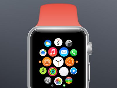
Apple Watch Icon Template
TL;DR Go to www.iosicontemplate.com and grab your download.
This week I had my first stab at designing an app for the Apple Watch. It became apparent quite quickly that you need to have the hardware frame around what you’re designing, otherwise you just cannot relate to that black rectangle. This is also because the black bezel plays a large role in creating the illusion of a larger screen. For me, I also needed to see a strap to get the feeling of that this is actually a watch I’m designing for.
My exploration of the Apple Watch’s design led me to incorporating the icon sizes in my iOS app icon template. The template is not only a tool I use in my work, but I hope by sharing it with the world other people will find it useful for testing icon designs. With the template, you see the whole range of contexts the icon will appear in, once in Apple’s eco system.
I can’t settle with just grabbing photos from Apple’s website so I redrew the Apple Watch hardware and its home screen. By playing with the template and the editable Apple Watch mockups, you can start forming an idea of what’ll actually be like to use the real thing. So head on over to www.iosicontemplate.com and grab your download.
If you enjoy it, I encourage you to donate an amount of your choosing.
