Focus Gallery
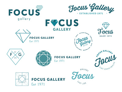
These were initial concepts for a new logo for Focus Gallery.
The client is turning the gallery into Nottingham's Jewellery Quarter, hence the symbols referencing carats. The client wanted to play on the history of the gallery with a vintage twist but without being twee and still having bold and clean feel. In the past the gallery has been painted teal so the client wanted to go back to its roots, starting with the logo.
More by Katherine Cory View profile
Like
