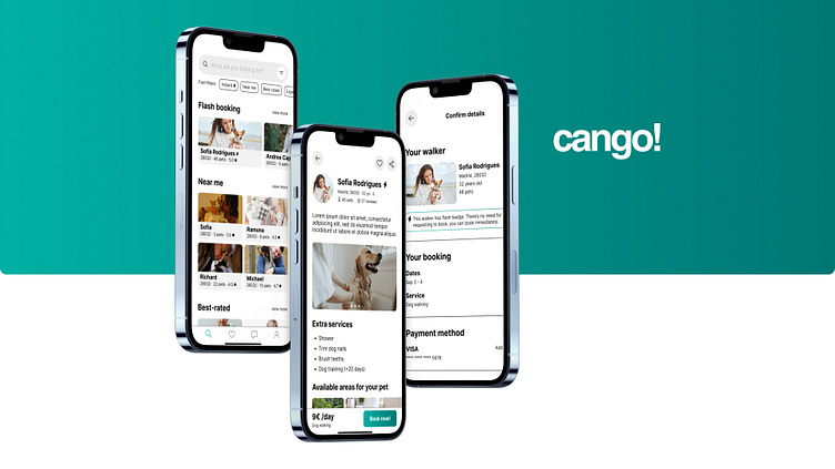
Cango! App
Cango! is a case study project I designed to help people to find a dog walker quickly with confidence.
Check it out here! :)
Design Brief & Context
In June 2022, I enrolled in Dribbble Product Design Course. My goal was to strengthen my skills and learn some real life standards.
The capstone project was to design a simple easy-to-use Dog Walking app in the first 8 weeks of the course, that would solve a real problem, finding them out through interviews.
Role: User Research, Market Analysis, Wireframing, Prototyping, User Testing, Visual Design
Duration: 12 weeks
Designer: Pier Di Silvestre
Mentor: Juan Carlos Díez Rodríguez
Tools: Figma and FigJam
Research and Empathise
Let start! The first to do was to understand user's needs, challenges and pain points. Later I conducted a competitor analysis to explore existing products that offers similar solutions.
Qualitative Research: Interviews
I have conducted video interviews with 7 dog owners from between 25-30 yo from Madrid trough video calls and face-to-face meetings to meet their insights and find some pain points.
The most of them look for pet-sitters just when unexpected trips comes up, and there is no time or chance to bring their beloved pet with them. Some of them also said that the best experience they had with a Dog Walker where receiving photos and videos of the pet, "it gave us peace to know that everything is ok with Lola and enjoying it".
Pain points: Little time for booking & trust issues
Insight: Receiving photos and videos
Not all the existing companies had solutions to these pain points, and this is an amazing opportunity to build trust between parties.
Competitors analysis
After conducting the interviews, I dived into the market analysis to find existing apps and websites.
Persona
After collecting the data on the market research and conducting the interviews, it is time to define our User Persona.
User Flow
During the interviews I noticed the majority saw positive the feature to find a Dog Walker quick and making instant booking.
Based on this insight, I decided not to put the classics onboarding screens and to postpone the Sign-up/Log-in for later in the process and start the user flow diagram from the Search Page.
Wireframes
Creating low-fidelity wireframes helped me conceptualize the main screens for the selected User Flow. Based on the research findings, I introduced the option to send photos or videos to the chat, a feature that will reduce the anxiety of any pet owner.
Moodboard
The biggest challenge is the lack of confidence, so I looked for an environment that would relaxing and calm: The ocean. So, I picked the turquoise green color bc is a very soft color with a relaxing feeling and mixed it with a grayscale palette with 5 tones and a easy-to-read font: Inter.
Visual design
I made many improvements with components, icons and menu bars, always focusing on accessibility.
After receiving valuable feedback from my classmates and mentor, I worked on some visual improvements: I worked on a better accessibility, updating the structure, spacing between elements and fonts size.
Final Design
Testing the Prototype
Testing the prototype was one of the most exciting parts of the whole process! I asked 4 people to use the prototype and shared their observations for future improvements.
So... What is next?
Working on this project has been a unique experience to understand the full Design Process. These weeks have helped me strengthen my Design Thinking mentality, always focusing on the client and accessibility for everyone.
It was very fun to improve my skills and learning along my classmates and mentor.


