Pawsome | Mobile Dog Walking App

Competitive Analysis
With a challenge clearly identified, the next charge was digging into competitive analysis to identify competitor applications. There are a handful of top-rated “dog walking” applications in the U.S. so I spent most of my time digging into which features made these solutions different from one another. I folded this information into a matrix, with the goal of providing a quick overview of the features that are commonly offered in “dog walking” apps and points of differentiation. Identifying their strengths and weaknesses would help me discern what gaps I could fill in my own app.

Market Research
I captured screenshots of the leading “dog walking” apps to familiarize myself with common wireframe layouts, user flows, and their associated interactions. This documentation process allowed me to better understand the users' preferences. Next I'll conduct a series of interviews to identify correlations between the quantitative data above and their qualitative input.

Interviews
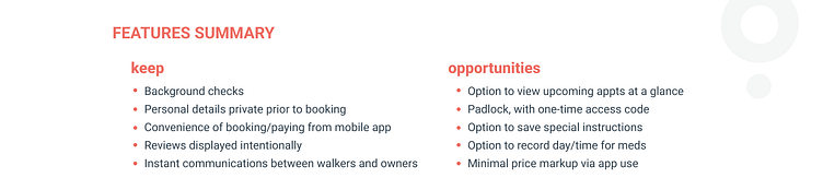
I interviewed five dog parents to ask them about their experiences with dog walking services (and applications) with the goal of better understanding their pain points and opportunities for enhancement. I used the same interview questions for everyone and I was really intrigued by the variety of responses across the group. Collectively, they cited the importance of high ratings, positive reviews, and gut feeling during their in-person meetup.

After reviewing the customer feedback and understanding their key needs, I revisited the quantitative analysis to understand what features are crucial as well as other opportunities for making the resulting application a leader in the market.
User Personas
I developed user personas based off of the actual interviews I conducted. In general, I focused on the needs of the dog owners primarily, rather than the dog walkers given the compressed project timeline.
I enjoyed this step of the process more than I expected for its truly empathetic user-centered start to app development.


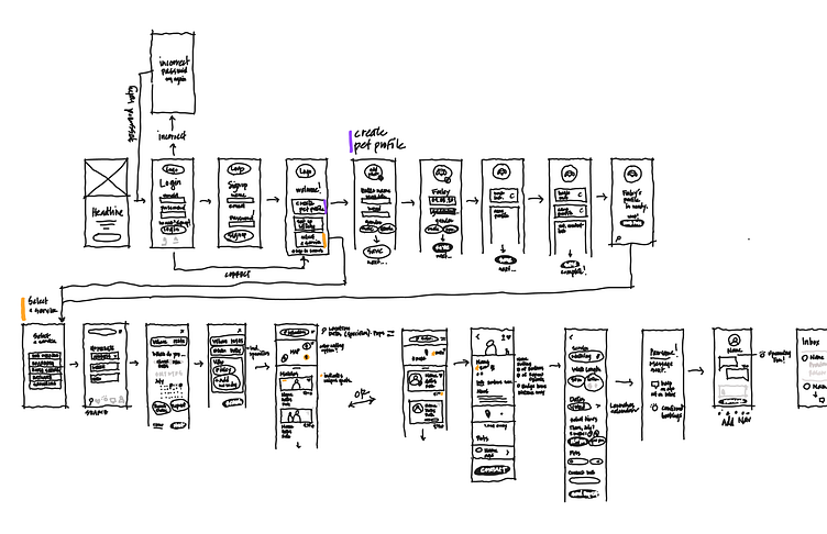
User Flows
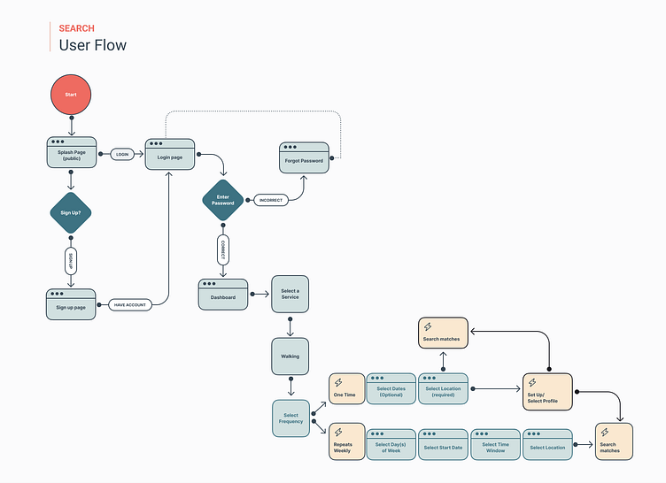
My first user flow aimed to simplify the account set up process--including individual profiles, billing info, emergency contact, etc. It also considered an option for building out customized profiles, like grooming preferences and desired training opportunities. By allowing users to set up account details in advance, they benefit from improved search results and a more streamlined experience.

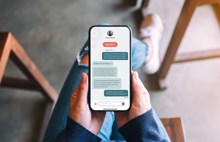
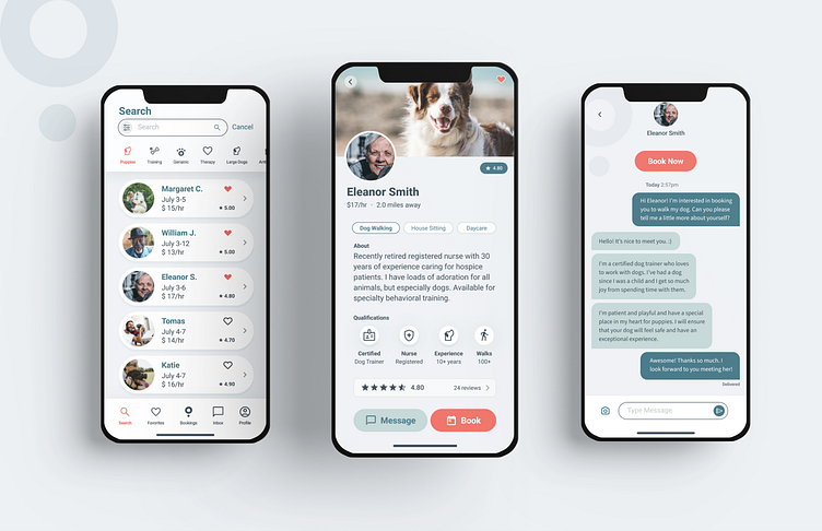
From there, I studied the search and booking flows, specifically for the dog owner’s experience.
Fortunately, most of these flows could be repurposed and used for the dog walkers as well since both will need account information and preferences (even though a walker's preferences would be more geared toward neighborhoods and time/date availability).

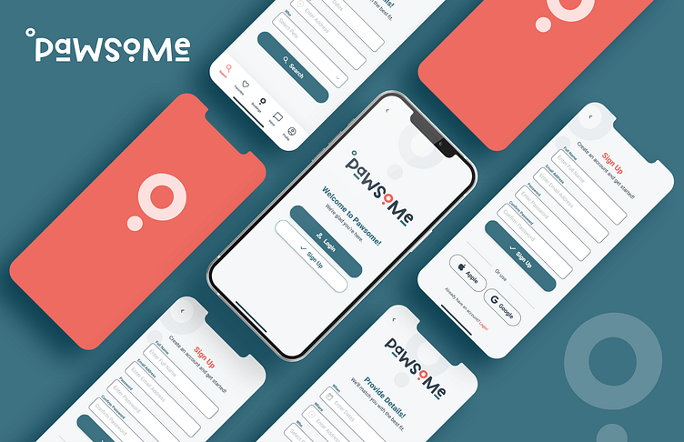
Wireframes
Next I began translating my user flows into low-fidelity wireframes. When my creative process started to be incumbered by the computer, I tried my hand at sketching. This somewhat analog exercise was liberating and allowed me to continue moving forward instead of staying stuck.
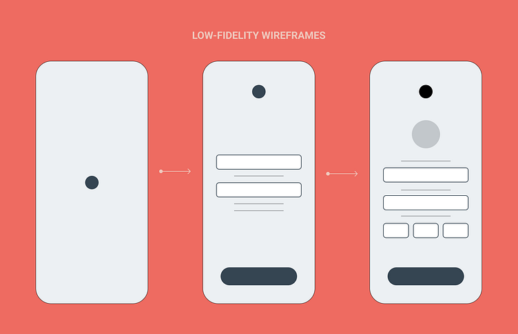
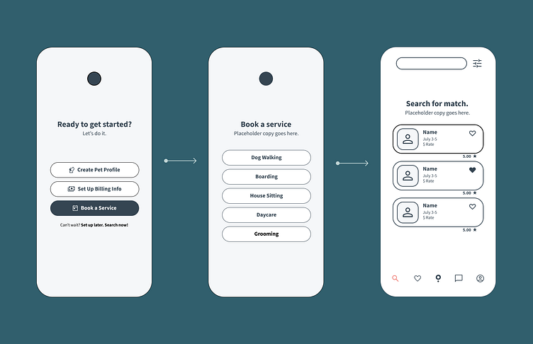
After I developed a series of wireframes that I felt good about, I started to build out higher-fidelity versions still using a grayscale palette.


Moodboard + Visual Design
Next I was ready to dive into an area that I had quite a bit of experience already--visual design. This step was really pivotal for me to set the look and feel tone.

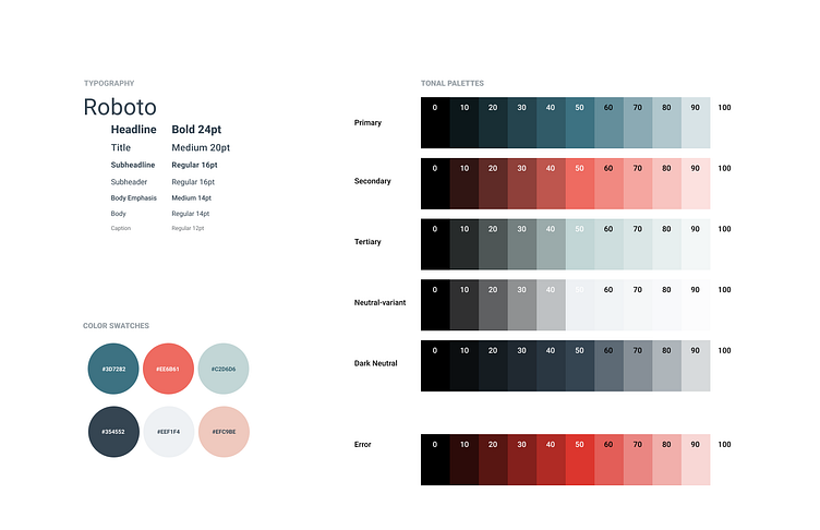
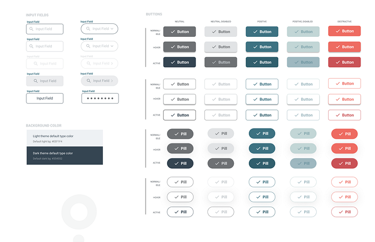
Component Library
One of the most rewarding parts of this process was utilizing the components I developed to build out a collection of cohesive visual designs. Learning how to build out the component library was challenging. With lots of practice I learned how to build and organize the components, which resulted in a streamlined process that ensured more consistency through the application.

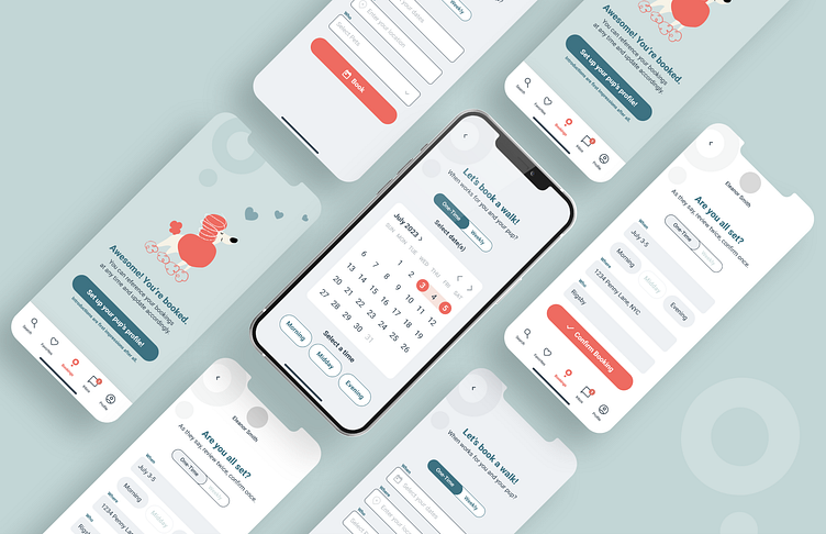
Prototyping
It was so much fun to consider how my application would function in a third dimension, interactivity. Prototyping really brought the user experience to light for me. I was surprised to learn that there are ways of simulating an animation-like look and feel between screens in Figma using the smart animate function.
Key Learnings
Overall, I learned the true value of user feedback, testing, and an iterative process. I am proud of what I accomplished in the compressed course timeline and look forward to using my new skills to create better products.
Next Steps
If I had more time to continue building out this application, I would have focused on the dog walkers' experience: mapping out user flows, creating wireframes and developing a prototype for testing and feedback.