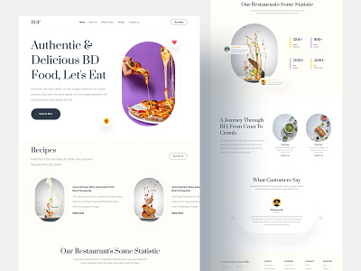
Restaurant Landing Page
Presenting a Homepage UI for Restaurant. I tried to make it look clean with more white space and tried to use some bright colors for the design to make it look interesting. Please share your feedback about the color choice and placement of the elements.
If you like what you see, don't forget the press the ❤️ icon and follow me Dribbble, and other social platforms to get exciting content and tips.
💌 I am open to new projects! hiahmed.ux.ui@gmail.com
More by Ahmed View profile
Like
