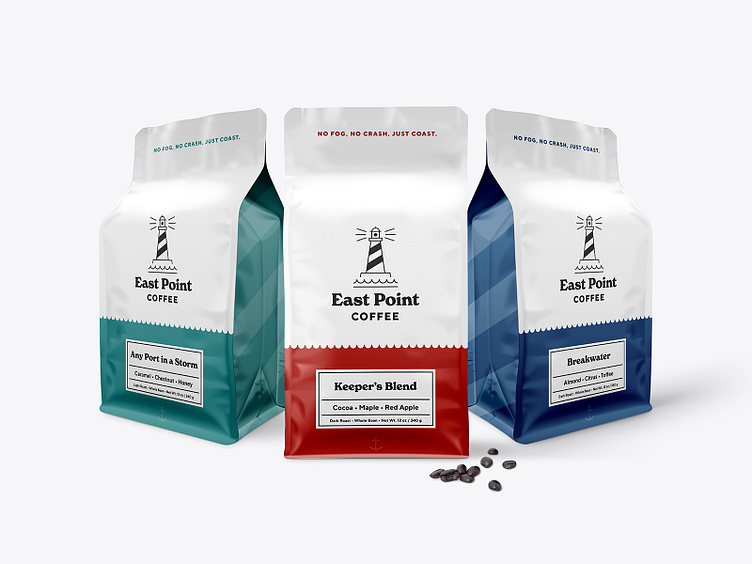
East Point Coffee Bags
Once I had the name, identity and tagline sorted out, I got into the coffee packaging. The waves from the identity were used to add separation to the bag where the name and flavour notes are displayed, while the angled stripes from the lighthouse create the pattern on the side.
The tagline lives at the top of each bag while a subtle anchor, well... anchors the bottom of the bag. Each product is named with a lighthouse or nautical theme, with a Dirty Heads album reference in there as well.
More by Brett Lair View profile
Like


