Dog Walking App - Case Study
The trusted dog walker app for your pet anytime, anywhere.
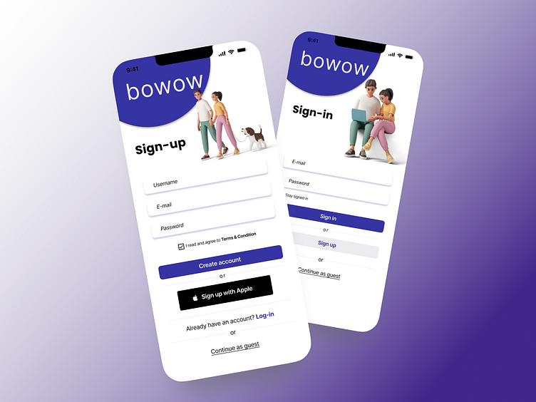
BOWOW is a dog walking mobile app service designed to connect dog owners with verified and trusted dog walkers.
My role: As the product designer for this dog walking app, I was responsible for the research, user flow, wireframes, visual design, and prototyping.
Problem Statement
Having pets and being able to walk them is an honor but we all have unplanned trips especially when it comes to work or unavoidable urgent family emergencies and during times like this, we need help from other people to take care of them. Family and friends are sometimes not available and there are trust issues involved when using the dog walking apps. Below is the storyboard I created using storyboardthat.
User Research
I asked a family member for this interview. His family owns dogs even before we met and every time they will travel (before the dog walking app existed), they try to find family members or friends or relatives to take care of their dogs. But not all the time they will be available. And now, with multiple dog walking apps existing, they are struggling with trust. All they want is the best for their dog so they are very picky when it comes to leaving their dogs with strangers.
Market Research
Then I compared the two most used dog walking apps in our region and made notes on their similarities and differences and what feature/features each app is missing. I especially took note of awkward walls where the app for force the dog owner to prematurely verify his or her identity distracting and losing potential customers with identify related fears and uncertainty (how will they use my information?). There are easy ways to defer this type of interaction and let new users focus on finding a relatable match that they entrust with the care of a family pet. I also noticed that the critical process of building trust was more of an afterthought and secondary to commercial concerns. With this "build trust first" concept and other feature gaps in mind, I was beginning to get a good foundation that I could use to elevate a number of key points in the experience. Through my research, I also noticed that once trust had been established dog owners rarely switched. There was exceptional loyalty which was tremendously important to the overall interaction. They would defer a vacation so that a trusted caretaker could be available to look after their pet properly.
User Persona
User Flow
I designed the app to give my user an option to browse and search for dog walkers and create their accounts when they decided to send the dog walker some questions. This will also help the dog walker receive messages from verified dog owners and avoid spam messages. The persona is able to view the availability dates of the dog walker. Also, the filter will show results that are available on the earliest date. The first image below is the draft of my user flow followed by the final design.
Wireframes
Include multiple images here, showing 1st and 2nd rounds of iterations. Explain why you changed and why. The first wireframe below shows the first simplest design attempt. The second wireframe shows the redesigned process after receiving feedback.
Moodboard
Following some UI guidelines, I decided to use their recommended colors to balance the contrast on my call to action, especially on my primary buttons. The color I chose reflects calm, focus, and sophistication.
Prototype & Test
Link to your figma prototype. Summarize your usability test. If you didn't have time to make any changes, write notes on what you might try next.
Takeaways.
On this dog walking app project, I have been exposed to the process of user experience as well as using the Figma design tool for wireframing and prototyping. My note to myself is to design more case studies so I can get more familiarized.


