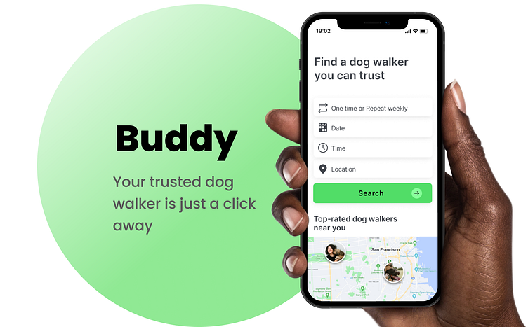
Buddy 🐶
Here is my most recent work on the app that helps you find a local dog walker you can trust.
Design Brief & Context
In June 2022, I enrolled in Dribbble Product Design Course. For the capstone project spanning 8 weeks, our class was tasked to design a Dog Walking app. This topic is very close to my heart - I have heard my friends struggle to find a dog walker for their beloved pets, so I was excited to work on this product!
My role: User Research, Market Analysis, Wireframing, Prototyping, User Testing, Visual Design
Duration: 8 weeks
Team: Zhenya Globazh, Juan Carlos Díez Rodríguez (mentor)
Tools: Figma, Miro, Airtable
Research and Empathise
The first step of the process was focusing on understanding the user’s goals, challenges, and pain points. Later I conducted a competitor analysis to explore existing products that address the same JTBD.
Qualitative Research: Interviews
I have conducted video interviews with 6 New York, San Francisco, and Phoenix dog owners via Zoom to gather user insights and pain points.
A fascinating insight: one of my interviewees mentioned that the best experience she had with a Dog Walker was when she received photos during the walks with her dog: it gave her a piece of mind knowing that everything was okay with her beloved pet.
This opportunity to build trust was promising but not very convenient in existing execution as it required additional communication channels (text). But what if we can provide a more convenient experience for this JTBD?
Competitors analysis
After conducting the interviews, I dived into the market analysis to find existing products.
Persona
After gathering all the data from market research and user interviews, it was time to define the Persona.
User Flow
During the interviews, two of my respondents mentioned how important it is to have quick access to the Dog Walkers search.
Based on this insight, I decided it would be better to postpone the Sign-up/Log-in till later in the process and map out the user flow starting from the Search Page.
Wireframes
Creating low-fidelity wireframes helped me conceptualize the main screens for the selected User Flow. Based on the research findings, I introduced the Real Map Tracking Experience to the flow, a feature allowing for tracking the dog's walk in real-time and reducing the anxiety of a pet parent.
Moodboard
The green color is often used to indicate safety. This is why I opted for a simple color pallet with a lead of light green color and friendly graphics to build trust.
Visual design
I went through several rounds of iterations, experimenting with color pallette, navigation, and improving accessibility.
After receiving valuable feedback from my class and mentor, I worked on some visual improvements: I updated the structure and main page navigation and worked on accessibility.
Final Design ⭐️
Testing the Prototype
Testing the prototype was one of the most exciting experiences! I asked 4 people to use the prototype and shared their observations.
What is next?
Working on this project was a fantastic opportunity to explore the full circle of the Design Process. I enjoyed collaborating with my classmates and learning from my mentor, and I am very grateful for this experience.
I plan to explore the Dog Walker side of the product. What are the goals and pain points in the process? How to create a better experience for them?


