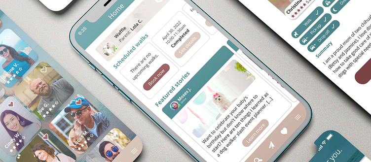
Buddy - Dog Walking App
As part of Dribbble’s Product Design course (June 2022), I designed a dog walking app called “Buddy,” a fictitious app that aims to solve many real problems that dog owners are facing.
MY ROLE
Market research
Research interviews
Product design
PROBLEM STATEMENT
Many dog owners have a hard time trusting non-family members to take care of their fur babies when they need to be away for work, travel, or gatherings. Dog owners’ needs include:
Finding someone whom they can trust to leave their dog with for a long time.
Finding someone who can provide special services (e.g. medication, training, pick-up services).
PERSONA
PROJECT GOALS
To build a dog walking app that improves the user experience for dog owners and dog walkers. Because “trust” and “worries” were frequently mentioned by the dog owners I interviewed, features of the app would need to be designed around establishing trust between dog owners and walker as well as facilitating their relationship.
USER FLOW
Here is an example of the user flow for onboarding.
WIREFRAMES
The wireframes for onboarding are built upon the user flow.
VISUAL DESIGNS
The mood board generated an overall nostalgic kind of vibes, suggesting that the dog walkers and dogs are spending quality time together while the owner has to be away.
With the above notes in mind, I was ready to create the first mock-up.
MOCK-UPS
Version 1.
My initial mock-up laid out many of the designs I had wireframed, but my mentor pointed out that there were many competing items, making it hard for users to know what’s the most important action to take. Also, some pages contained too many requests, which could lead to frustration.
Version 2.
In Version 2, I addressed the issues with Version 1 by adding more white space and avoiding having too many competing colors in one page.
With this version, I ran usability testing and received feedback for further improvement.
What the users liked:
Easy to search for a dog walker
Calming colors
Ratings for the dog walkers
What could be improved:
Having too many home pages is confusing. It’d be nice to have one home page with a couple of features that are easily accessible.
Final
In the final version, I adjusted the onboarding process by adding a verification code page and asking users to identify themselves as dog owners, dog walkers, both, or undecided. I also added a home page with a simple user description, scheduled walks, and featured stories written by other users.
HIGHLIGHTED FEATURES
Aside from private messaging, a way to establish and maintain “trust” between dog owners and dog walkers is to show the status and progress of a dog walking event. This ensures dog owners that the dog walker has done the requested service(s) and allows the dog walker to check things off their list.
CONCLUSION
Through this project, I learned that “trust” is a very important determining factor for dog owners’ decision-making process. To address this, I designed “Buddy” to include the following features:
Ratings of each dog walker
Detailed profile
Private messaging
Status and progress check.
This way, dog owners can ensure that their fur babies are doing okay while dog walkers can build trust with the dog owners by showing that they have completed the service(s) as requested.
COMPONENTS


