Baby Sleep School
THE PROBLEM:
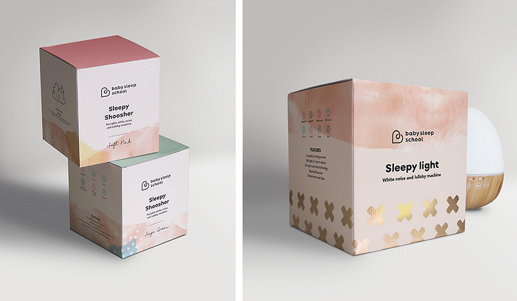
Baby Sleep School had an existing logo and branding, but as they expanded into new areas like products and an app, it was time for a refresh. It needed to appeal to a female audience and feel bright and contemporary.
THE SOLUTION:
A suite of coloured splashes and brush patterns were added to unify the brand. A watercolour texture features as a base to help modernise and soften the visuals.


