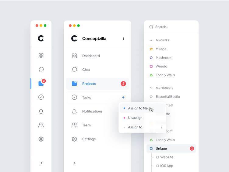
Team Dashboard UI Components
Easy-to-see UI elements are crucial for a successful design, especially when you are working on dashboards with large amounts of data.
This dashboard for team management is a perfect example. Its UI components have lots of white space and clear rounded font. These choices boost the overall dashboard readability. Few color accents make it easy to spot important information. As a result, the design doesn’t overload the eyes.
Let's collaborate!
hi@conceptzilla.com
Discover more about us at conceptzilla.com
More by Conceptzilla View profile
Services by Conceptzilla
Like
