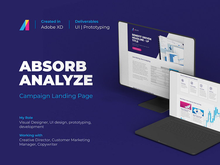
Absorb Analyze Landing Page Campaign
Background
Absorb Software is dedicated to empower people and organizations to excel through learning. For that purpose, Absorb LMS was designed to set new standards in both eLearning software and support, as we believe anything worth doing is worth doing fanatically well.
Absorb Analyze is the next evolution of Absorb LMS reporting. With Absorb Analyze, users can gain deeper insight into their learning program and the path between learner data and business results. This improved and customized reporting solution is replacing its previous iteration, Absorb Inform, with new and advanced features that empower businesses to act based on their LMS data.
The Brief
How to persuade clients using Absorb Inform to upgrade to Absorb Analyze?
In 2021, as part of our efforts to transition clients to the new reporting tool, our Customer Marketing Manager wanted to refresh the Absorb Analyze landing page and find a way to highlight the main differences between Absorb Inform and Absorb Analyze.
Working together with the copywriter and the creative director, our goal was to create a new landing page that highlights the most important features of Absorb Analyze and why it is more robust and flexible than Absorb Inform.
Solution Ideation
Wireframes
What makes Absorb Analyze the best full-service LMS business intelligence tool
Based on the main goal of the campaign, this landing page needed to focus on three main sections:
What Absorb Analyze offers to the clients
Why it is better than Absorb Inform
What are the main new features Absorb Analyze brings to the table
With this in mind, I started my ideation process by creating very rough sketches on paper to get some ideas on how the information should flow on the page.
Once I had a better idea of how to structure the page and lay out the information in a way that provides the user with the general idea of the content, I moved my sketches to a digital environment using Adobe XD and created high fidelity wireframes to share with the creative director.
Revisions
Improving the user experience by clearly differentiating sections
After the first revision, I realized the layout was very similar to our previous templates (which tend to make the user scroll longer and it’s not easy to spot different sections when skimming the page). So, I solved this by modifying some of the sections to add more color and some interactions to let the user know where they are.
The team ultimately chose the last iteration for its clean layout and readability making it easy for the user to spot the information they are looking for with minimal use of color and subtle interactions.
Prototyping + Test
Creating the new landing page in Marketo
For my prototype and final deliverable, I coded the approved design in Marketo in order to test the interactions and make sure the landing page could be edited by anyone using the template.
After a couple of changes on the copy and how the campaign was going to work, the Absorb Analyze landing page was launched at the end of 2021 and it’s an asset still in use to promote the upgrade from Absorb Inform to Absorb Analyze.
Lessons Learned
Creating this new landing page and turning the final prototype into a template was a fun experience that not only required me to break the mold on how we have treated landing pages for product launches in the past, it was also interesting to bring more focus on how the user will interact with the page and trying to keep the content short and engaging to provide the essential information to the user that will help them upgrade and start using Absorb Analyze.
I think for this project, it would’ve been a good next step to corroborate our design assumptions with user testing so we can gather more external feedback to keep in mind for future campaigns. Perhaps with more time and budget, it would’ve been interesting to conduct more in-depth research and it could be a next step for future projects and updates.


