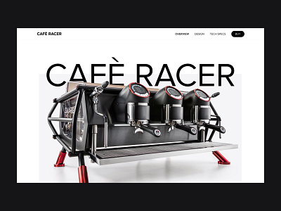
UI/UX Redesign Web Page Café Racer Espresso Machine (Concept)
The Café Racer contains the most advanced temperature and water volume control, delivering exceptional precision, at high volume. Every aspect of this machine has been designed and developed to help the barista make better coffee faster, more consistently and with greater ease.
When redesigning the web page, our biggest challenge was finding a clever way to organize information. We had to create something useful for the Café Racer Espresso Machine team and their readers. For the Espresso team, the design of the overview of the product had to be flexible to adapt to the news of the day; and easy to build and use on a daily basis. For readers, the design had to be interesting enough to keep readers engaged, readable on all screen sizes, and uncomplicated enough to make a lot of information easy to scan through. We created what we call Clean design, which organizes information into a cue card structure that delivers messages clearly and swiftly. Overall, we created a brand with a variety of elements that make getting the news as easy as getting a cup of coffee.
Note: this design I did just for practice and portfolio, and and not affiliated with the company.
