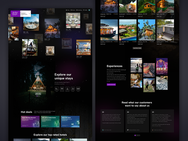
Hotel Landingpage
Holla People,
Recently, I worked on the uplabs challenge.
Here is my submission for the Hotel deals website.
It was a creative exercise to come up with our version of the design.
I chose a black theme as my idea was to showcase the vastness and wideness of the concept. I wanted to give a sense of the hotel chain widespread across the world. Hence, the black & open theme with tiny white dots feels like stars and sky.
The primary color I chose is Violet RYB. I wanted to spark the feeling of emotions, imagination, and luxury.
Every design decision has some thoughts, whether related to color, sections, making something pop out, and when to neutralize the section or element to make a balanced design.
Thank you
More by sonal View profile
Like


