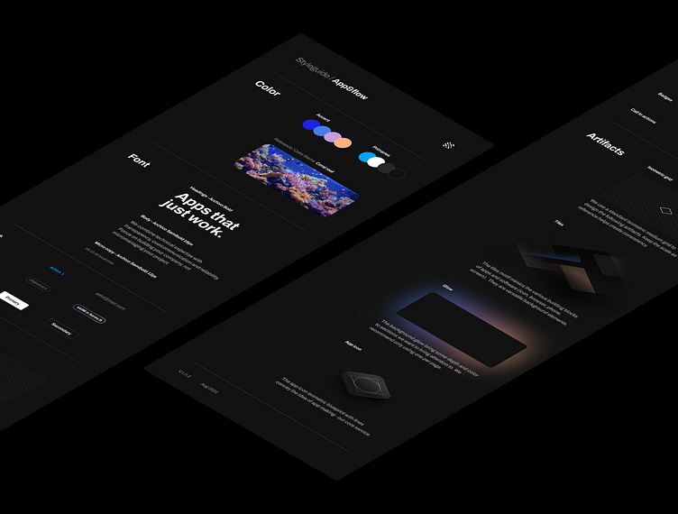
App&flow mini styleguide
I rarely get much brand assets or guidance when I start working on a web project for a small company. Recently I got in the habit to use this as an opportunity to create what I call a mini styleguide. "Mini" because I don't want to reinvent the branding and reassure the client that it's not my intent; but still organize and eventually suggest ways to evolve the visual identity to fit in the upcoming web work.
This strategy has allowed me to adopt a system for all the artifacts/graphics earlier than previously. Here is an example of mini styleguide for App&flow website redesign project.
More by Nicolas Solerieu View profile
Like
