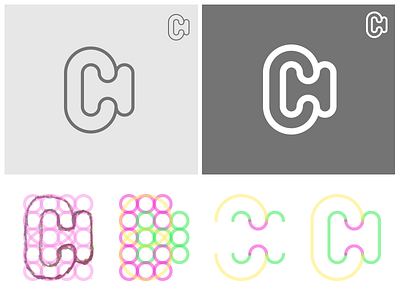
CH Monogram (rounded version).
CH monogram with construction grid.
Tried to capture my working process throughout Illustrator. Started with a sketch on paper, followed by figuring out witch element should be the fastest and cleanest way to achieve the look of a strong and minimal monogram.
_
A little explanation with this shot:
1. Trace the sketch in Illustrator: I like to work with basic shapes so the outcome is always pixel perfect and nicely aligned.
2. For each path try to use a unique color to separate the elements.
3. Cut out the path we don't need. All the edges here we set to a straight line and connect them all.
4. Make them complete by connect all lines together. Also all the lines are rounded here.
_
Still I'm more satisfied with the sharper/blocked version in my previous shot. Mostly because the 'H' in this version didn't came out as nice as I was hoping.

