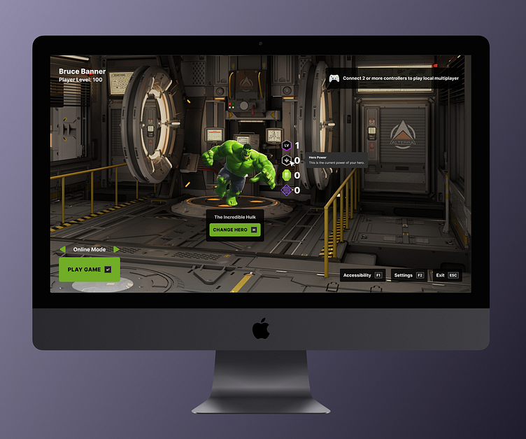
Minecraft Dungeons: Marvel Edition
Overview
Background
This is a fictional project for ELVTR's UX/UI for Gaming class. To develop skills and insight on how to design UX/UI for games, I learned the process and created artifacts/deliverables based on Minecraft Dungeons.
Role
I was the sole UX/UI designer.
Timeline
~8 weeks
The UX/UI of Minecraft Dungeons
Similar to a heuristic analysis, I watched a youtube video of a play-through of Minecraft Dungeons and described the in-game experience. I captured screenshots and notes for the following:
What decisions does the player make in the game?
What options does the player have for each decision?
Why does the player make each decision?
Here's a link to see closely the artifact above.
Player Journey
Like an empathy and customer journey map combined, I created a player journey map to indicate:
What does the player see?
What does the player hear?
What does the player think?
What does the player feel?
What does the player say?
Opportunities to improve and help players achieve what they want to do
Here's a link to see closely the artifact above.
Paper Prototype
I created a paper prototype with sticky notes that each show:
Screen name
Available choices
Here's a link to see closely the artifact above.
Flow Chart
I created a flow chart based on my paper prototype to show:
Screen name
Option name
Condition
Here's a link to see closely the artifact above.
Wireframe
I created a wireframe for 3 screens:
Home
Gameplay
Inventory
Usability Test
I conducted a usability test remotely to collect feedback from one of my course-mates via Discord.
Research Objectives
Evaluate wireframes (design communication) with players to understand potential miscommunication
Can players understand key options per screen without assistances? If no, why?
Can players quickly start playing game from [Home Screen]?
How do players feel about the design overall?
Iterate design based on the usability test feedback
Determine pain points/errors and why
Research Questions
How would you start a game (home)?
How would you open your inventory (gameplay)?
How would you equip/un-equip (inventory)?
What do you think about all the options you have on gameplay screen?
Final thoughts?
Results
All 3 out of 3 tasks were completed successfully with little to no difficulty
Some icons were not clear to understand what they convey
Uncertainty on what options are actionable
Wireframe Iterated
Based on usability testing, I iterated my wireframe with the following:
Added tooltips that appear when hovered for clarity without disrupting gameplay
Changed stroke color of slots in action bar of gameplay screen to emphasize more as actionable options
Added an informational icon near “Enchantments” in inventory screen for context, which includes how to enchant
High Fidelity UI
I created a high fidelity UI with the help of some assets I found:
Image of Hulk via Google Images
Most icons sourced from Windows 11 Color in Icons8 Figma plugin
Home screen background from Alexey Pyatov
Gameplay screen background from Andreas Moritz


