Belly iOS Redesign
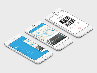
Here are a few screens we've been working on for a new release of our iPhone app.
There were a lot of interesting challenges on this project, specifically with the Home Screen. The goal was to design a Home Screen that achieved two completely different things: (1) provide a way for newer users to find and discover Belly Businesses near them to enroll into their rewards program; and (2) provide members easy access to progress at businesses they're already currently enrolled into. While designing for loyalty and customer retention is our top priority, we needed to provide new users with an accessible way to start their loyalty journey. These are two very different needs that provided a lot of interesting considerations during the design process. It will be interesting to see where our iterations take us.
Launching soon!


