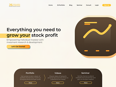
Financial UI Website Design
Study Case. A website UI/UX project I did a few months ago was redesigning an Investment Research website. My client requested an easy to understand website that doesn't change where things are from the previous web. A simple design that contains color palette of the logo. Maintaining brand identity and existing targeted market (23 - 65 years old). I redesigned the website but wasn't satisfied with the results, since I was also in charge of the backend and doesn't have much to work with.
This is another approach of the same website, with the same requirements (maintaining brand identity), I would like to use if I was going to be trusted with only UI and UX. So I came up with this hero page. An easy to understand page where users can basically know where they are and what to do in first sight.
