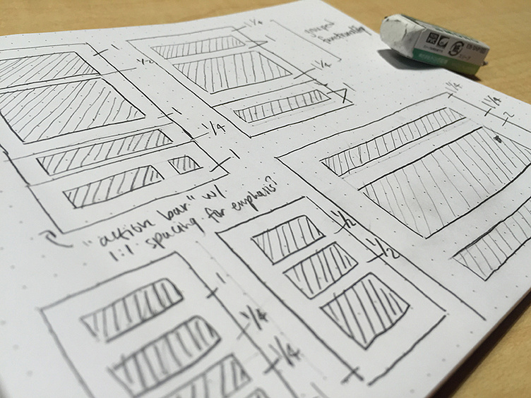
Widget Proportion
Taking a second to step back and explore proportions for our revised widget system.
The primary goal is to find a system that uses space between elements to establish visual consistency. It needs to be flexible to account for n situations, but specific enough to keep our users' visual fatigue at bay.
Considering defining groups of primary and supplementary elements with tighter and looser padding, respectively.
More by Nichole Burton View profile
Like
