Business Article Layout
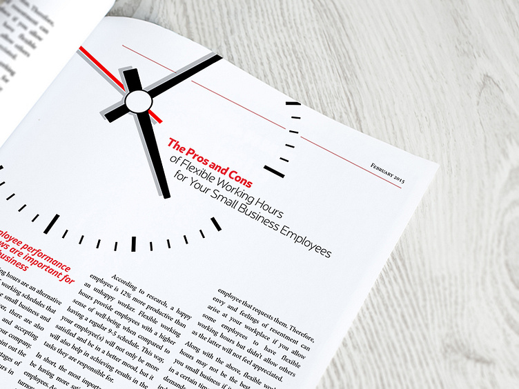
Another magazine design for the Small Business Funding Report. This time an inside page featuring one of the articles.
I usually like laying out the copy on the page (or the spread) first and seeing what kind of space I have to work with. And then using an image based around the theme of the article, which I anchor the design around in terms of colour and header type.
As always, feedback welcome!
More by Lehel View profile
Like
