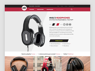
PSB Speakers Redesign Concept
I got a set of the PSB M4U's a few weeks ago and loved them. I found the PSB Speakers website to be lacking and decided to mess around with this concept over the past week.
I've been seeing a lot of slant type designs lately... went one step further and tried a slant navigation/search combo.
Check it out the Full Pixels and let me know your thoughts.
Thanks! :)
More by David Snowden View profile
Like
