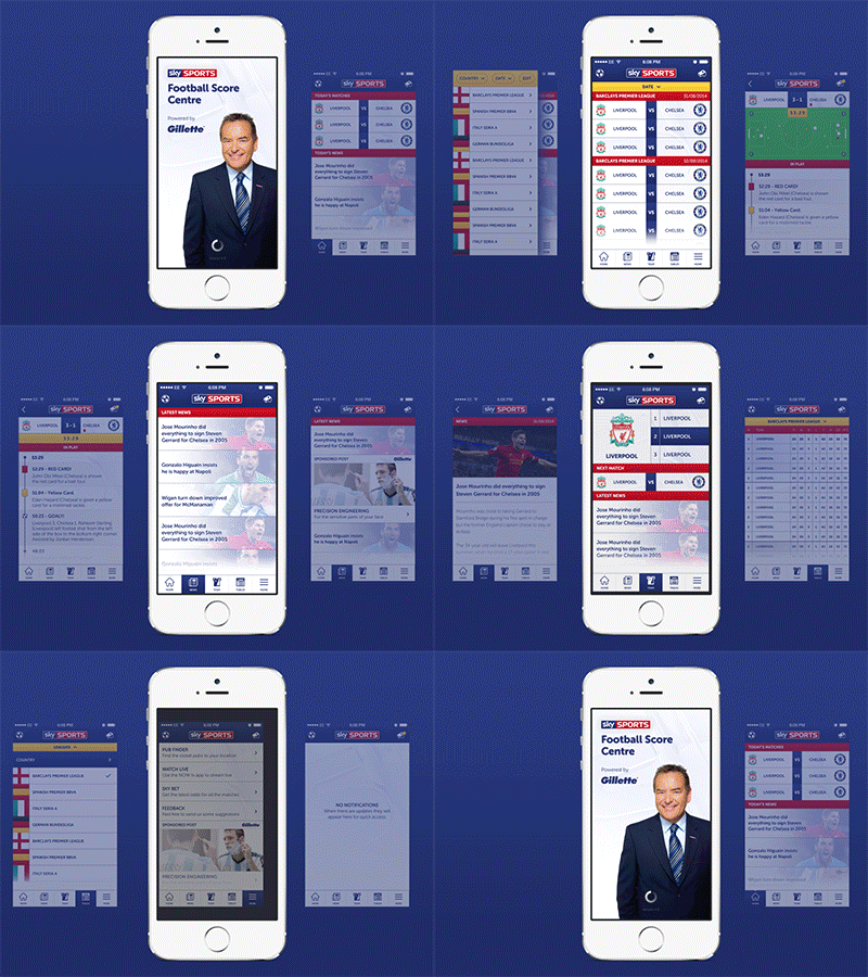
Sky score centre
As a self initiated exercise this week I decided deconstruct the Sky score centre app and refine its ux design.
I practically use this app everyday and it bugs the hell out of me that it seems to lack any type of focus for its intended purpose.....and don’t even get me started on the ad banner fixed to the bottom of each screen.
So the first of the three big changes I made was to switch to a tabbed nav at the bottom of the screen giving quick access to all the vital sections. The original nav was in the draw style which housed around 12 links...strangely half of these were either external links or irrelevant ones which could be integrated into other sections. These links were moved into the "more" tab so access was still possible.
Secondly the most important section for me was “Upcoming fixtures” so I made this a prominent and permanent button in the top left. This housed a list of all competitions which could be filtered and re-ordered.
Finally I took the crummy advert banner and created an in-line style ad platform that would become integrated throughout the app. This would hopefully result in more conversion and maybe at some point feature tailored ads dependant on the users favourite team.
Ui & iconography still need more consideration but thought this was a good start at taking an existing app and re-thinking its experience rather then just another re-skin.
Thanks for checking this out and let me know what you think.


