Modal, mobile vs desktop
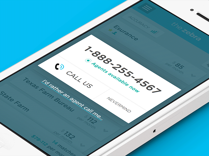


Working on a handful of tweaks to The Zebra app. On desktop, the "match" modal (where the user enters in all info when ready to buy) has a bunch of forms fields and steps. It's kinda daunting, even for desktop.
This is our quick fix, wherein mobile users will get a super-clean popup, hopefully prompting a call. They also get the ability to skip the call and fill out a long form, but booooo to that.
Since a phone call is required during the binding process anyway, I figure it's safe move to push anyone holding a phone to just go ahead and give us that call.
Real pixels attached...
