J:on - Rebranding
J:ON is a Korean cosmetics brand with the basic idea that beauty is inside each of us and inside each J:ON’ product.
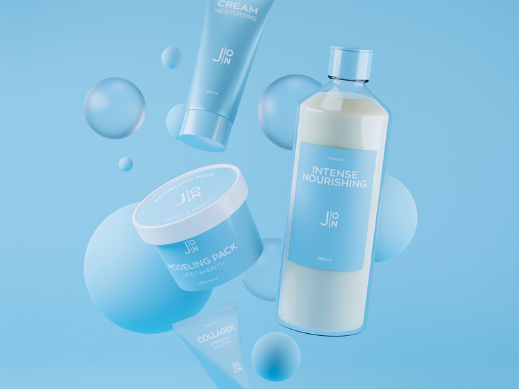
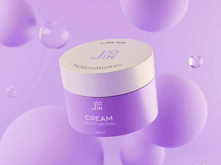
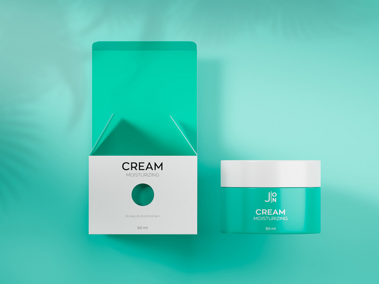
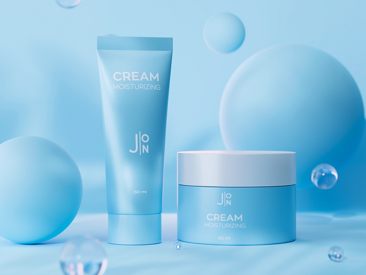
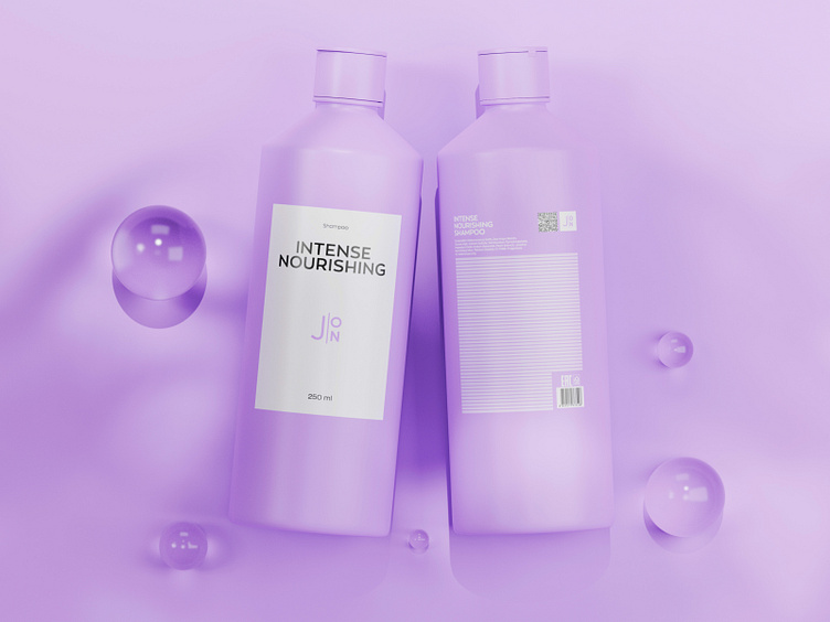
The brand’s goal was to make its products demanded for both Generation Z and Generation Y. We designed a packaging that reflects friendliness, simplicity and care. But at the same time it remains progressive and not boring. Monochrome and minimalism are the main techniques we used. The emphasis is made on color filling of the boxes on the inside, which reflects the essence - 'beauty is inside'. And the white, minimalistic box on the outside is outlined against the competitors' colorful packaging on a counter.
We will be very happy to make a project for you.❤️
🎉 Follow Me on Instagram :
Have project?
You can send a quick message: