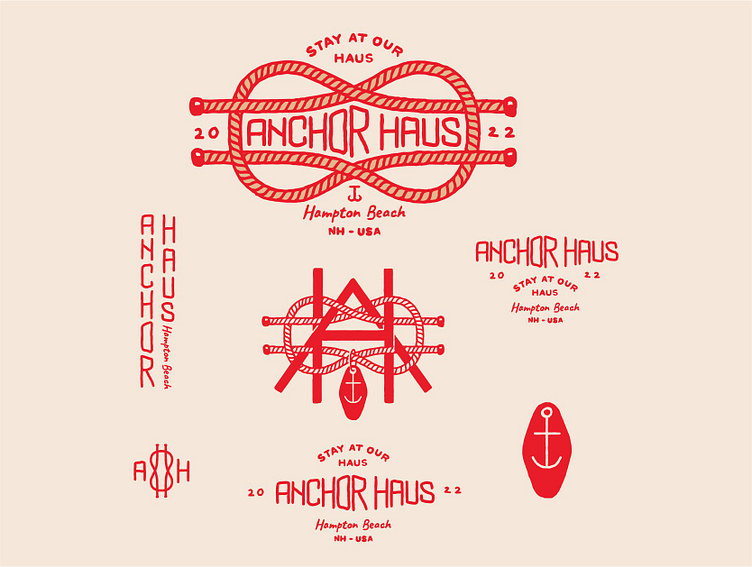
Anchor Haus
Logo suite for a family-friendly boutique vacation home
in Hampton Beach managed by Stay at Our Haus.
The client envisioned an organic, masculine logo with a heritage
element that will enable the brand to grow its customer base.
We started off with 3 concepts exploring the nautical theme,
the brand's name and the area of business they're in.
Once the main logo was finalized, we developed the concept to create
submarks - wordmarks and monograms for use in different contexts.
The main logo is a beachy design that features a nautical rope & knot.
It utilizes hand-drawn type for a human touch and a welcoming vibe,
enhanced by the channeling of vintage designs that evoke nostalgia.
The color we decided on is red, as it helps Anchor Haus stand
out from the competition – beach homes that mostly use muted
shades of blue and yellow as their primary brand colors.
Anchor Haus' target audience are families with children
looking for an elevated space where they can enjoy their
vacation and create memories with their loved ones.


