Shield & Rose
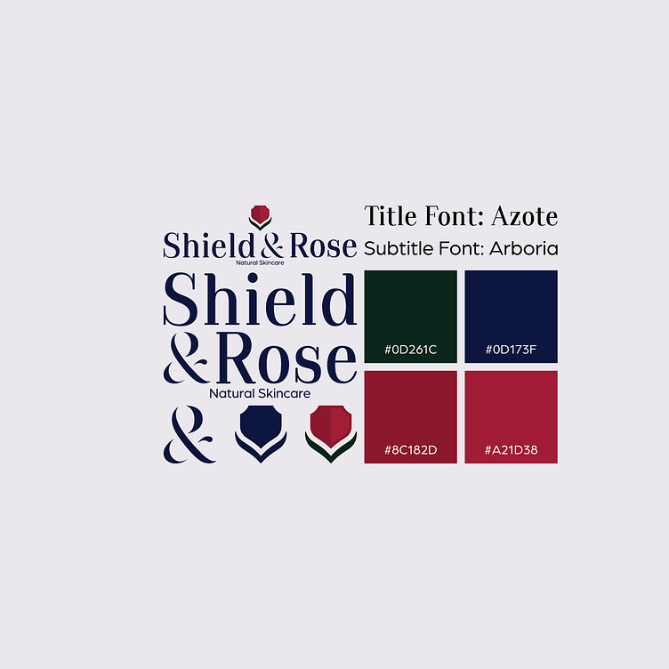
Shield & Rose Concept: I made a logo for an American Skincare company called Shield & Rose. The icon itself is an abstract rose with a shield-shaped flower. The wordmark is a modified Azote font that is filled in and rounded with a stencil-like yet fluid appearance. The main color is a deep and calming yet sophisticated blue and the leaves are a deep earthen green representing the brand's commitment to nature. The red shield is reminiscent of a rose and is shined to represent freshness and vibrancy. I am still very new to graphic designing so feedback is always appreciated :)
