Latitude 18 Logo Design
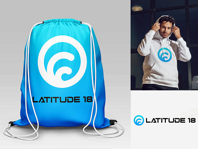
Logo design for Latitude 18. They wanted a Caribbean feel (colours and waves) and also an indication of the location, hence the double meaning in the logo (a globe with the latitude lines).
Do you have a logo project? Let's work together! mariolands@gmail.com