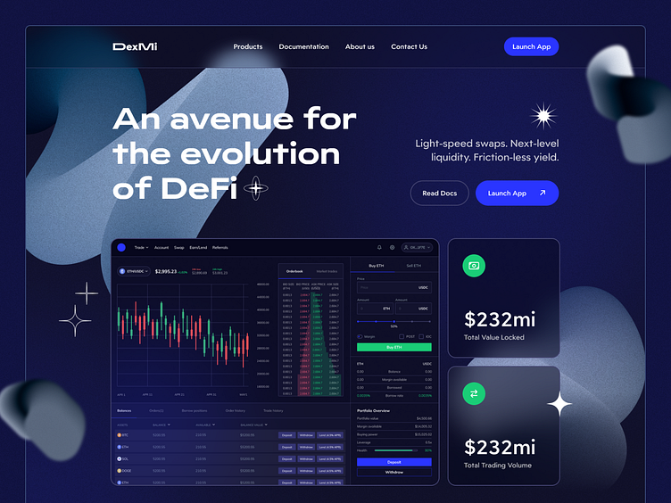
Web3 concept #2 - Dex Landing page
👋 Hello everyone,
A great DEX is always data-driven, and I’ve emphasized that with this landing page. The main overlay, which is a shot of the actual DEX app, is packed with market data and options to get you buying/selling crypto easily. Meanwhile, back on the landing page itself, I’ve included a useful nav bar and actionable CTA buttons. It’s all visitors need to get smart and get started.
But what happens when a DEX landing page doesn’t put enough effort into ui? Let’s be real: it’s uninspiring, ugly, and even sketchy. To dodge that kind of UI disaster, I used easy-on-the-eyes colors, typography, and geometry. So the landing page mirrors the design of the DEX itself.
Have a project in mind? → Let’s get started
More by Koncepted View profile
Like
