Corporate Website
💌 Have a project idea? We are available for new projects!
hello@ronasit.com | Telegram | WhatsApp | Website
Having a well-designed website with useful information gives off the impression that you are running a reliable and credible business. Meet our new concept of a design studio’s corporate website!
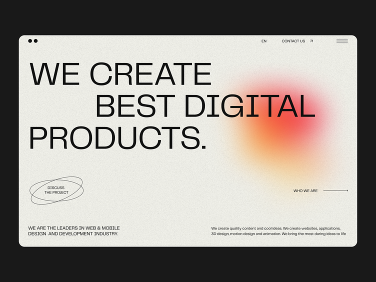
The first screen displays the company’s motto. The next two screens display the company description and a list of its services. Another screen displays the list of the team members and their responsibilities. The last screen displays the contact information.
Our designers used neutral grey shades for the background and added blurry gradients as the main colorful accent. This simple color scheme doesn’t distract users from observing the company’s portfolio.
The minimal design, large print, and colorful accents convey the company’s mission and emphasize its creativity. The simple navigation and clear information layout make the website pleasant to use.


