Burndown chart details
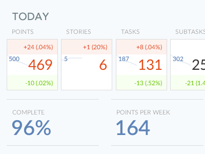
Want to get into the details of an agile project? How much work is being done, and how much was added on? This was an idea to make the stats look like baseball game cards, allowing the user to get a quick overview of the days activities within their project.
Would this be useful data? What do you think the parts represent?
Press L to show some love
AtTask is now Workfront
Follow the Workfront Team
Not collaborating with Workfront yet? Love your work again ...
More by Workfront View profile
Like

