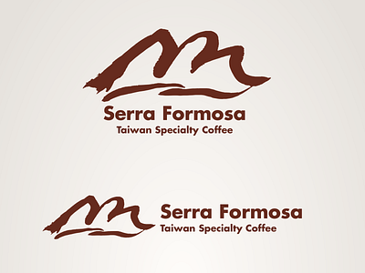
Serra Formosa - Logo Design
Serra Formosa is a branding project for a (fictional) association of Taiwanese coffee farmers in order to market their coffee products to international customers. The design for this brand includes the logo, packaging, stationary and website.
The logo, which features mountain shape in ink drawing (sumi-e) style, is inspired from the mountain ranges in Taiwan. It features three geometric mountain shape which looks like floating on the sea, conveys ‘Taiwanese image. The name of the brand means ‘beautiful mountains’ in the Portuguese language, is based on Taiwan’s romantic nickname ‘Formosa’ called by Portuguese explorers in the Age of Discovery.
This name delivers strong ‘coffee-like’ and exotic imagination (Latin America is a major origination of coffee), as well as the local (Taiwan) relationship and the premium image of Taiwan-grown coffee. It can also be easily pronounced by people around the world.
