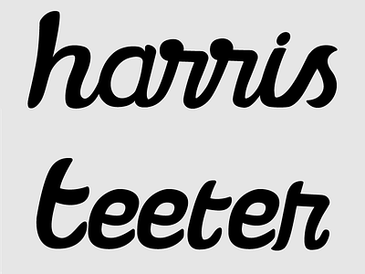
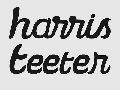
HT Rebrand WIP Update
Just a quick update on the logo. The main differences are the fixed up R in Teeter and a slightly straightened beginning T in Teeter. This being my first logotype project, I am very inexperienced would love to hear some feedback or some pro tips. Hope you like it so far, and I hope you have a great week!
More by Danny Megard View profile
Like

