Custom Typeface - "RISE"
RISE: A typeface for young learners
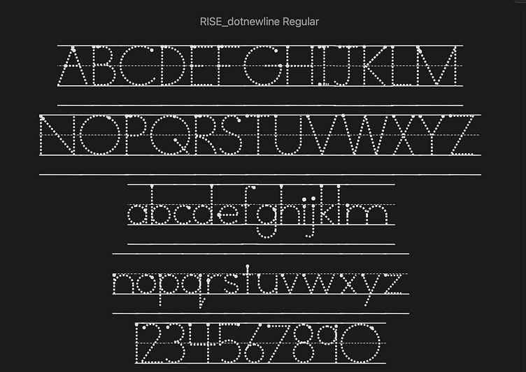
The publishing team at RISE Education had a challenge. They wanted to find a font they could use for their writing books for young learners. They specifically wanted one that had dots for tracing the letter forms but also had bigger dots to show the user when they needed to place their pencil to start crafting the letter. They also wanted a version of that font that included a dashed line at the center and solid lines at the tops and bottoms that could connect seamlessly. I worked with a group of teachers to find the perfect letter forms for training kids to write. This is what we came up with - a typeface that has been tested and proven to be the easiest to produce by unsteady hands.
Variations
Most typefaces I've designed have included fonts that varied by weight. This was the first time I've designed fonts that varied by function. There are versions that include directional arrows in addition to the starting point dots that indicate the direction the pencil should travel in order to create the letter. There are versions that include another line below the line at the bottom of the letters to indicate where the next line of text should begin.
Outcome
The typeface was a big success. Teachers reported that the new writing books produced better results faster than books they've used previously. RISE continues to use it in all of their publications worldwide. (I love that something I've designed can be found in classrooms in places like Vietnam and Saudi Arabia.)


