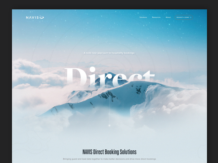
Navis | Rebrand + Web Design & Development
As part of Navis's move to an Explorer brand archetype, we redesigned and rebuilt their website using natural dramatic imagery with pops of color and bold typography.
Below is the process we took to get there.
Phase 1: Establish Style
1) Strategic Direction
Determined conceptual direction: changing from “Caretaker” brand archetype to “Explorer.” Gathered examples of existing brands for inspiration: Tesla, Patagonia, Airbnb.
2) Moodboard Motifs
Gathered visual examples and refined with client until specific patterns or motifs were identified that expressed that strategic direction:
▸ Moody natural images with pops of color
▸ Dramatic type woven into images
▸ White text & technical lines over images
3) Initial Brand Looks
Combined motifs into visualized brand looks. Includes colors, typography, photo / illustration style. Serves as a temporary internal style guide throughout the project.
Phase 2: Design & Deliver
4) Initial Designs
Chose 3 initial designs to establish varying formats with actual content:
▸ Primary landing pages
▸ PPT deck
▸ Social post templates
We also created an internal timeline for product and company milestones.
—
“Working with brightbase, I was able to lift off an amazing rebrand for Navis and produce an astonishing amount of production output at the same time. Their team’s work is impeccable from the creative to the accountability and care they put into every step of the process. Brightbase is a partner you can trust with your brand."
Casey Munck
Senior Director, Marketing | NAVIS
—
brightbase
A better creative service built around your business. brightbase is the new alternative to freelancers, agencies, hiring, and subscription services. Fast, flexible, full-service creative and web teams. Made to scale.


