Mosaic Home Page: Hero
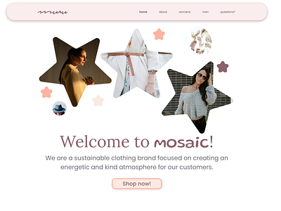
Hey everyone! I created a landing page for a sustainable clothing company called Mosaic. I took the idea of a mosiac to have a more abstract meaning. I used stars, circles, and squiggles to give a mosaic like impression. I also chose a completely squiggly font, called redacted script, for the company's logo mark. Since this isn't readable in a traditional sense, I also used a font called Gluten for the logo type. I think that both of these fonts allude to the company's goals of creating exciting and sustainable clothing that portrays kindness. For the main headings, I chose to use Lora because of its rounded shapes and motion. Lastly, for the body copy, I decided to use Poppins because it is very easy to read and contrasted well with the headers. Let me know what you think!