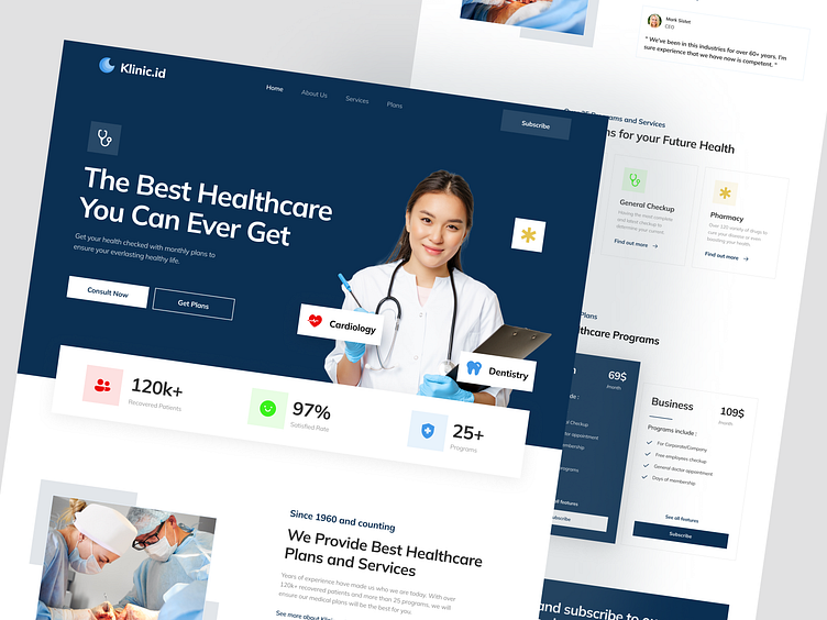
Klinic.id - Healthcare Landing Page
Bonjour no Dribbblers! 🤩
This is my design exploration of a Healthcare Landing Page called Klinic.id. Klinic.id provide you information about the healthcare you need and the price. You can also see the doctor team and the programs they are handling.
I'm using clean and minimal layout, while not misdirecting or cutting the content about it. And also, the dark blue color and white matches a lot with little accent color. You can also scroll down to see the process such as wireframe, Hi-fi and preview too!
Wireframe
So the wireframe is just the simple side of the design to tidy up the layout as well as concepting the content to be included. Definitely helps me to imaging what is what, which is which and so on.
Hi-Fi Design
Now for the Hi-Fi, I don't want the design to become too crowded and poked your eyes, so I'm making it as clean as possible while again, not cutting the content and the description. So people can actually know and understand what they are seeing.
Full Preview
Hope you guys enjoy and press "L" if you like it ❤️
Any feedback or comment? Feel free to leave comments below.
Interested to collaborate with us? Say hello at aksantara.digital@gmail.com or visit Our Website
_____________________________________________________
We provide design services for your business:
1. User Interface Design
2. Mobile / Website Design
3. Logo & Brand Design
4. Mobile / Website Development, see our portfolio
_____________________________________________________
Check out our portfolio at:
🌏 Visit aksantara.com
📷 Follow us on Instagram
🛒 Product on UI8


