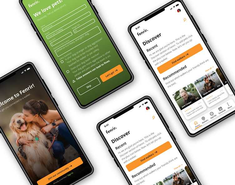
Fenrir Dog Walking App
OVERVIEW
Challenge
Dog owners don’t have a lot of time to take care of their dogs and dog walkers need a place where they can find people who require their services. The issue is that it is difficult for dog owners to trust strangers with their pets.
“I don’t ask outside my bubble”
-Possible User
Goal
The goals of this project are:
Creating trust between the dog owners and the dog walkers.
Allowing dog owners to easily contact their preferred walkers.
Maintaining walker safety by giving them proper information about a pet owner’s pet(s).
Create an achievement system that walkers can use to show their skill and pet owners can use to vet walkers.
Role
This is a solo design project for Dribbble Education’s Product Design Bootcamp.
DESIGN PROCESS
The Steps
Research & Empathise
Market Research
For this project, I looked at the desktop and mobile experiences of Wag!, Rover and Puppr. As the project went on Rover became the main source of reference.
Rover Pros
Offers more than just walks.
Gives worldwide service.
Allows users to add multiple pets.
Caters for various pet sizes.
Allows pet owners to keep in contact with their sitters.
Has secure, in-app payment.
Rover Cons
All services need to be booked beforehand (no on-demand service).
You cannot browse caregivers before adding a pet.
User Research
To start the research process I sent out a form to three potential users to see how they took care of their pets. I looked into whether or not they used any walking or sitting services and what their thoughts were on them.
Dog Owner Persona
Dog Walker Persona
Define the Problem
Pain Points
These are the main pain point that I saw when working on this project:
There is a lack of trust between pet owners and walkers.
A pet owners pet may have unique needs that need to be addressed.
Walkers find it hard to sell themselves and explain why they are trustworthy.
User Flows
Competitor User Flow: Wag!
Fenrir User Flow Sketch
Fenrir User Flow
Ideation
Initial Thoughts
To get my initial ideas out I used FigJam to write down my top 8 concepts. After that, I was able to look through them all and see which ones had merit.
Crazy 8: Thought Generation Exercise
Visual Research: Colour
The colours I chose were meant to create the feeling of being in nature. The main colour of orange relates to the brilliant orange of the sun.
Colour Style Guide
Visual Research: Typography
Open Sans is used throughout the entire design. Its simple design makes the app more inviting while also making important information easy to read.
Typography Style Guide
Visual Research: Components
The icons in this project have round edges to give them a soft and inviting feel.
Components Style Guide
Visual Design
Fenrir High Fidelity Screens
Prototype & Test
Lessons Learned
After the first version of the app was made I was able to get it tested by five potential users. They were given certain key tasks to complete to test how user-friendly the app is. The overall consensus was that, visually, the app was easy to use but the way some things were worded detracted from the experience. One of these users was a dog walker who was able to give me insight into safety issues that I had not thought of before.
“I think there needs to be a box that you can check if your dog is leash reactive, dog aggressive, or stranger aggressive. In addition, think there needs to be a disclaimer that hiding these details opens you to a fine as these things have not been told to me in the past and have led to issues.”
-Potential User
Annotations
Fenrir Documentation
CONCLUSION
Summary
Outcome
The final result is a dog walking app that is simple but comprehensive and will allow pet owners and walkers to connect with each other. On my path to becoming a product designer, I have done a lot of self-study, meaning I picked up a lot of information in disjointed pieces. However, completing this project gave me more experience in using the product design workflow.
Final Thoughts
Designing the app has been a challenging and rewarding journey. My goal was to provide a simple solution while showing my thought process.


